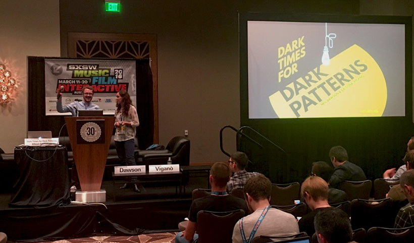
Dark patterns are interfaces that try to trick their users into doing something they would otherwise not want to do. They are lucrative, but damaging to both the user experience and the brands that employ them. As a designer, I find this topic really interesting: How can we guarantee benefits for our users and meet our business objectives at the same time? I got the opportunity to speak about dark patterns and persuasion at SXSWi 2016 in Austin, Texas. Here, I’ll summarise the highlights of my experience.
SXSWi is a huge festival for industry experts to share their research, ideas and the latest innovative developments in the sector. Against the sunny backdrop of Austin, Texas, the conference is set in a tremendously energetic and festive environment, where inspirational talks are combined with delicious food, non-stop parties and amazing people. It’s hard to put into plain words the vibe that you feel from the very moment you set foot in the city.
Speaking at SXSWi is a unique chance to start a discussion with an interdisciplinary and smart audience. I was really excited to find out that I was selected to join this year’s line up, by popular vote in SXSW’s PanelPicker platform.

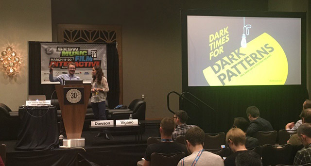
Neil & I were invited to speak about dark patterns at this year's SXSW festival.
Shining Light on Dark Patterns
Have you ever started to receive regular newsletters without remembering when you signed up? Or have you ever had trouble closing an account because the instructions on how to do so were very cleverly hidden? Like many before you, you have probably fallen victim to a dark pattern.
Dark patterns are very manipulative interfaces. They can be as simple as a checkbox asking if you’d like to join a mailing list; but, having it preselected by default and carefully hidden so it would be difficult to notice. They can also be more complex, contacting your network through your social media and email accounts without you even realising it.
As a designer, I strongly believe that our field’s mission is to improve users’ experience, so I should avoid using deception or misinformation. However, as an employee, I still need to achieve our clients and brands’ objectives.
But how exactly does this work in practice? What can we do to balance user needs with business goals? How do we get to build persuasive but ethical interfaces and eliminate dark patterns?
Together with Neil Dawson, Senior Experience Designer at Analog Folk, we explored alternatives to infamous and common dark patterns. Here is a summary of the topics we delved into during our keynote.
1. HOW CAN WE IDENTIFY DARK PATTERNS?
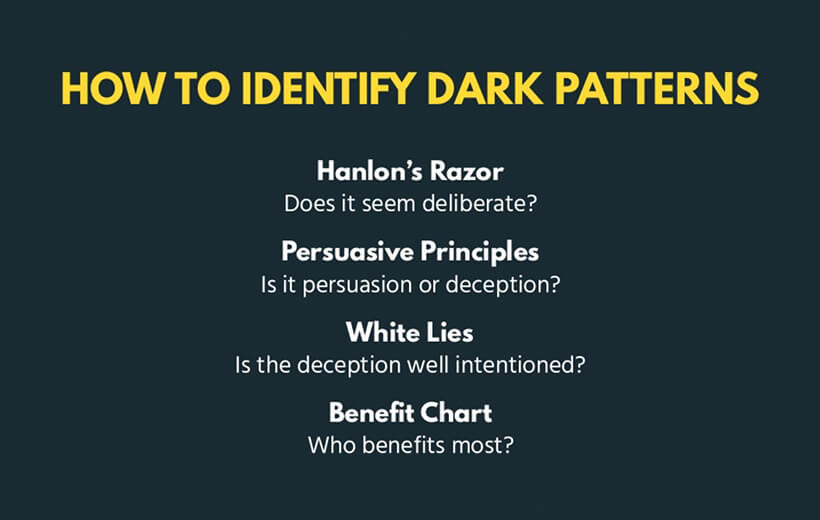
If we want to get rid of dark patterns, we first need to become comfortable with identifying them. In our talk, we highlighted a few principles that can help you determine whether an interface is a dark pattern or not.
First of all, ask yourself whether the interface seems intentionally designed to trick the user. Applying Hanlon’s Razor, it could have been an honest mistake: “Never attribute to malice that which can be adequately explained by stupidity”.
Does the pattern benefit the user, community or just the brand? This question can help us distinguish dark patterns from persuasive design. The Principles of Persuasive Technology can also help distinguish the two. Daniel Berdichevsky wrote that: “The creators of a persuasive technology must consider, content with, and assume responsibility for all reasonably predictable outcomes of its use.”

Neil and I explored four questions to help you distinguish persuasive design from deceptive dark patterns.
2. WHAT ALTERNATIVES ARE OUT THERE?
How can we design to persuade users to undertake actions that will also benefit our business? Neil and I analysed a simple interaction between a user and a brand, fragmenting it into three macro steps:
- Raise awareness
- Convert
- Retain
In each stage, we identified examples of how designers can achieve their goals by applying principles from persuasive design instead of using dark patterns. In this post, I will focus on the second step: looking at the touchpoint where a customer is encouraged to convert. For some products, conversion means getting customers to buy, or to buy more than originally planned.
To achieve this goal, some brands use a dark pattern called sneak into basket: when a user is online shopping, an extra item is added to their basket. If users do not spot this product, they will end up paying for something they never purposely agreed to buy.
However, other interfaces follow a more ethical approach derived from persuasive design. Some effective examples are:
- Urgency: If you offer a good deal with an expiration period, people will feel more rushed in their decision-making process. By suggesting that there is a need to act now, users are more likely to purchase the product for the fear of missing out.
- Scarcity: The principle is very similar to the one described above. But instead of focusing on time-sensitivity, it limits the availability of the product. Once again, this increases the speed of users’ decision making process.
- Anchoring: By modifying the context and the order in which items are presented, designers can change the perception of cost for users. For instance, by presenting a less expensive item after users have already committed to a costly purchase, they will perceive it to be cheaper than if it had been presented beforehand.
3. WHY SHOULD WE AVOID DARK PATTERNS?
Dark patterns seem to be very lucrative for brands, so why should we stop using them?
Aside from ethical reasons, dark patterns can cause your business economical damage – some big brands such as LinkedIn and Ryanair had to pay hefty fines for their practice – and they can have a negative impact on your brand reputation. Although these tricky interfaces appear to be a beneficial short cut to your goals, you need to think carefully about the long-term consequences before adopting them.

Adopting dark patterns can be detrimental to your business' credibility and brand perception.
Summary
SXSWi 2016 was a greenhouse of inspiration - it’s been an honour to speak there and hear from a very clever and interested audience. From tips on A/B testing and the future of virtual reality and augmented reality, to fast food and the mission to go on Mars, there were plenty of topics to get your creative gears clicking.
If you are interested in learning more about dark patterns check out our presentation slides below – or follow us on Twitter for more UX insights!


