If this isn’t your first time visiting us, I’m sure you’ve noticed our fresh look. Here’s the brief explanation behind our decision to take on a rebrand, as we celebrate the 10th anniversary of Cyber-Duck.
The Cyber-Duck story began in 2005, from my North London bedroom. There I created our first logo, an abstract duck made from the letters C and D. We got a lot of mileage out of that design.
Under that identity, we multiplied from a team of one to 35 and built countless websites and products. Our old duck icon brought us to the offices of incredible clients, scores of award ceremonies, televisions around the country, and conferences around the world.
In the lead-up to our 10th anniversary, our team took the opportunity to step back.
We reflected on our progression, and asked ourselves a question: what is Cyber-Duck about today?
We are:
- Responsive to the needs of clients, users, and the ever-changing technology landscape
- Exceptional in everything we do
- Creative in our approach to the work we produce, and our philosophy to invest in creative research and development
- Performance focused, whether it’s optimising our processes or achieving our clients’ goals
- Expert professionals, who lead and teach our clients and peers
Through this process, it became more and more clear that we needed an identity that both embodies our past and will continue to represent our evolution for years to come. It must be underpinned by a sense of our unique approach: effective quality management system, lean values and thriving R&D culture.
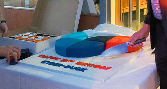
After exploring concepts, receiving staff and client feedback, and months of hard work from our brand team, we finally revealed our new look at our 10th anniversary boat party this month. Now we’re proud to share it with you.