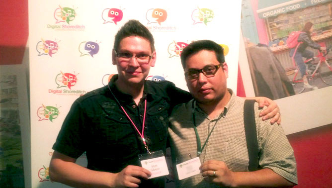
Cyber-Duck headed into London to teach Digital Shoreditch festival attendees about Adaptive Web Design. Our Production Director, Matt Gibson was joined by our Front-End Developer, Ramon Lapenta for a table-top discussion; attracting a great audience, eager to get involved.
Matt’s discussion named “Adaptive Web Design: Does Size Matter?” which took part on Wednesday’s Brands day, looked to inform users about the benefits of Adaptive Web Design and why all new web projects should look to optimise their websites for a variety of devices and contexts rather than just desktop. The discussion then went on to say how you should pitch such an idea to your boss or potential clients and the UX (User Experience) considerations which need to be thought through when creating your adaptive website.
During Matt’s discussion, both he and Ramon looked to engage users with the Digital Shoreditch website and suggested ways to improve the current website’s features on tablet and mobile through an adaptive design. Matt and Ramon encouraged attendees to review what would be the most important features to mobile users visiting the Digital Shoreditch website and then worked together to create paper prototypes of what a mobile version of the website could look like.
The pair found that the features suggested were actually the features desktop users would also regularly engage with too. This illustrated how taking a mobile first approach to design can help you focus on what is particularly important for the user (as per Luke Wroblewski’s fantastic book on the same subject).

All in all the day was a great success for Matt, Ramon, Cyber-Duck and everyone involved at Digital Shoreditch. The team were delighted to have taken part.


