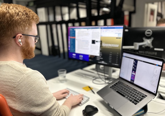
Frontend Development
Your customers need fast, dependable experiences. Our frontend team writes modular, scalable and accessible code that looks great and works across all browsers and devices for a premium customer experience.
Your users need fast, dependable and inclusive digital experiences. Our frontend team writes modular, accessible code that’s optimised for lightning-fast loading and dependable performance across multiple devices and browsers.
Collaborating closely with our backend developers, our frontend team connect the logic of your application to its design, then add visual impact and unique branding with animations, styling and rich media.
Accessibility and inclusion is embedded into every one of our processes. Our front-end code meets WCAG 2.2 AA guidelines for accessibility, is compliant with the UK Government’s GDS audits, and meets the highest standards demanded by public-sector organisations. But we go beyond WCAG recommendations; you’ll also benefit from our learnings from previous projects and partners like the RNIB.
When it comes to technical SEO, we structure pages so search-engine crawlers can easily read them, and ensure all meta tags, schema markup and rich snippets are optimised and placed correctly. Your users won’t see any of this – but it will help them find you.


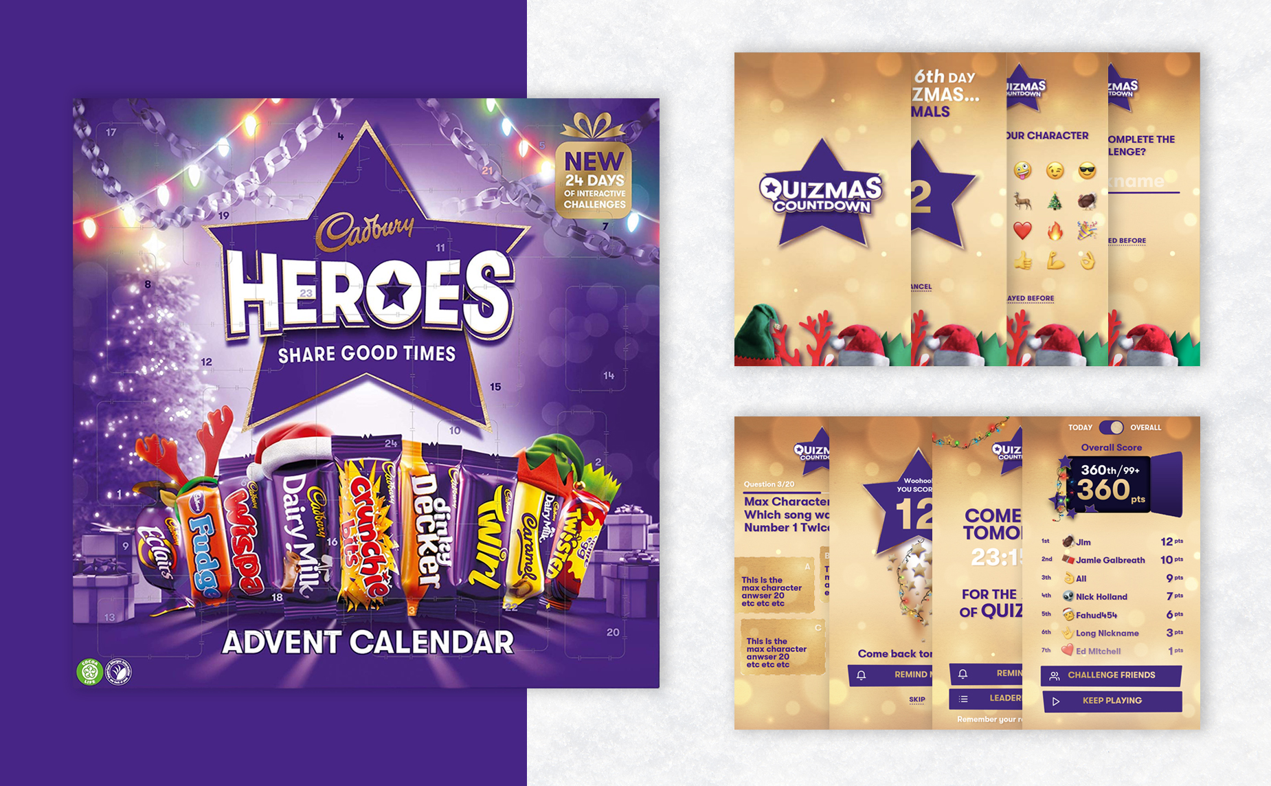
Our SaaS solutions will streamline your operations and limit your team’s workload by incorporating third-party applications. It’s a scalable solution, automatically updated and easy to access.
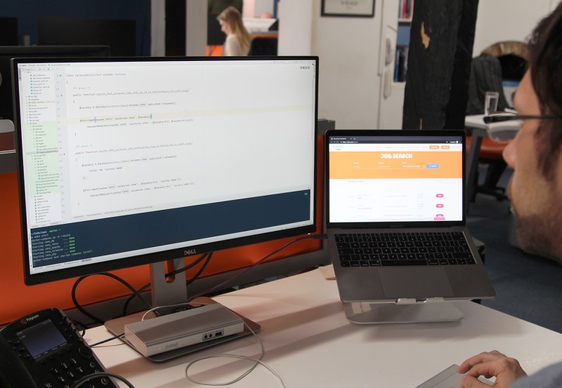
Following our unique user-centred design process, we will highlight key elements your app or website needs. Our in-house developers will then create reusable components for your team to use, using the best technologies and frameworks to suit the unique requirements of your project.

Vue.JS is a lightweight, maintainable, and testable JavaScript frontend framework that reduces development time and empowers teams to build scalable, interactive and intuitive digital products. The progressive frontend framework can be used to power individual components of your application, and we can use Vue’s core libraries and ecosystems to scale.
We’ve created single page applications, robust Software as a Service (SaaS) solutions and NativeScript mobile apps using Vue.js. Once your new Vue app or website has been deployed, we’ll continue working with you to maintain and support the Vue components, implement new features, and optimise performance.
React is a lightweight, modular framework that fits well into any tech stack and lays the foundation for a scalable, maintainable codebase. React applications are built to be fast and responsive, even if dynamic content is used.
Our React developers can use the framework to build reusable components, facilitating iterative, fast, effective development, even for complex interfaces. Once your React application is built, we also offer maintenance, support, and implementation of new features. Combined with our DevOps services, we optimise your entire development pipeline and deploy your React app with minimal downtime.
Whatever the project or particular challenge you have in mind, we’re here with the right people, process and technology to help deliver the transformation you need.