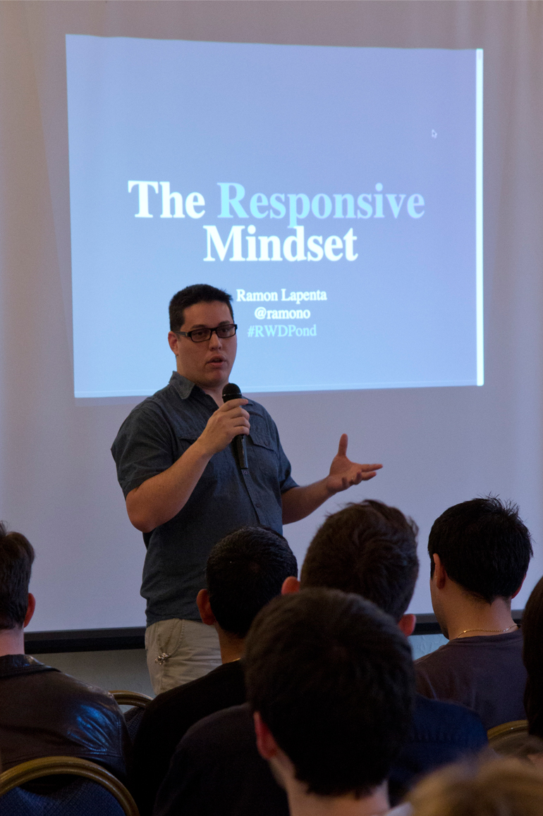
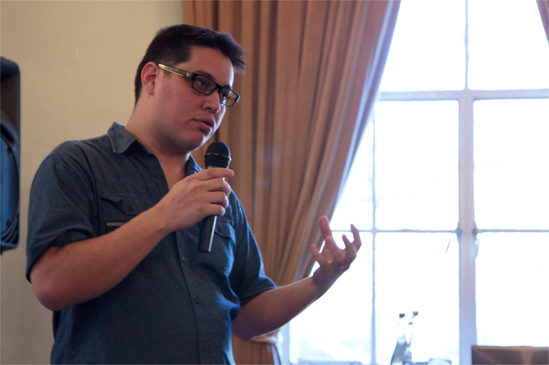
This is an overview of my talk on 'The Responsive Mindset' I gave at last week's Digital Pond on the topic of Approaching Responsive Web Design. Thanks everybody for coming along and especially my fellow speakers Paul Adam Davis and Rachel Andrew. It was a fantastic evening and we are really looking forward to the next event.
Thinking Responsive
How do we define responsive? Dictionary.com says that the definition of responsive is “To react quickly and positively.” I want to make an extra emphasis on the fact that this definition implies that the reaction is positive. If we place this definition into a web development context, we can say that responsive web design (RWD) is a design approach that aims to create interfaces that react quickly and positively to the user’s conditions.
Opening up the talks for the evening to over 150 Digital-Ponderers.
There are literally hundreds of technologies and resources available right now to help us in our search for true responsiveness; CSS3, media queries, JavaScript libraries, feature testing, documentation, blog articles, conferences, etc. With so many resources available, how do you pick what to use?
You have to determine the components and features you need, then you can start analysing the available libraries or plugins by answering a few questions:
- Are there any other options are available?
- Can I do it myself?
- Does it work on all devices?
- Does it have a fallback for older browsers?
- And ultimately: Does it make the experience better for affected users?
After that, you can make a wiser decision by understanding the needs of the project and by knowing the capabilities and weak points of the available solutions.
Performance
Performance affects everybody. Us developers usually have big powerful computers that can handle everything we throw at them, but that’s always not the case for our users. There are thousands of devices out there accessing the internet, from cheap phones to old computers using all kinds of connections we don’t know anything about.
Explaining different aspects of the responsive mindset.
We don’t know how many people use their laptops connected to a mobile hotspot. We don’t know how many people use their smartphones on high speed fiber connection. We don’t know how many have a better internet plan in their mobile phones than their homes! In short, we need to stop assuming things about our users. For example, a big screen doesn't necessarily mean a better connection than a small screen. This is not only about connection speed or data caps, it's about processing power, battery life, memory, graphics, and so on.
Sometimes we over complicate animations or interactions and the only reason we do it is because we can and it's easy. It's the 'ooh shiny effect'; we all want to use that shiny new plugin that's just been launched because it looks so cool, without really considering its future-friendliness or even appropriateness.
Making decisions based on research will help you find better solutions that help the project’s performance and flexibility. Making research informed decisions is good for any project, but is a must for responsive ones.
Flexibility
I was going to say that we developers tend to be lazy, but then I realised that we are not lazy, we are efficient. We always find ways to make our work faster and more efficient and this is good. This is one of the main reasons why we see all these frameworks popping up everywhere, like Twitter Bootstrap, Foundation, Skeleton, Boilerplate, Grid this, Grid that, etc. They exist simply because we don’t want and don’t need to work from scratch every time.
But there’s a fundamental problem with most of them: they try to fix everything. They want to cover every possible scenario. Eric Meyer once said of Reset CSS “This is a starting point, not a self-contained black box of no-touchiness”, but that is exactly what many of these frameworks have become for developers, black boxes of no-touchiness.
We avoid messing with the underlying code because when it gets updated we’ll lose the changes. Or we can’t update the framework because we made changes that we can’t lose. If we want to change things whilst keeping the ability to update we end up overwriting half of the framework rules. Then each element gets styled four times in the process (browser stylesheet, framework reset, framework style, our style).
My recommendation would be if a framework doesn't do exactly what you need, it's probably best not to use it.
Accessibility
Ultimately one of the key goals of RWD is reaching as many people as possible and trying to assume far less about them and their environment.
One of the problems I have noticed when using off-the-shelf frameworks is that they rely too much on JavaScript for basic user interactions. Collapsible elements, responsive navigation, form controls. And many of them do it in a way that injects inline styles into the HTML.
If you want to be more accessible, you need to leave styling to CSS and use JS only to change the “state” of an element. Forget about "slideUp", "slideDown", "fadeIn" and "fadeOut" JQuery methods that add inline styles to the elements. Use states and CSS Transitions to design the behaviour of your elements.
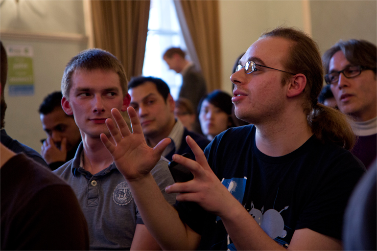
Audience participation is rightly encouraged at the Digital Pond.
Control & Maintainability
Knowing your code from top to bottom is essential to have total control over it. Using frameworks will never help you achieve this.
When you work on a team, and even more when you lead a team of developers, you need to be able to answer questions about the code, you have to be prepared to be challenged, to make changes, and knowing your code is the only way you can do it.
Have a good understanding of the file structure and your code. Own it, and make your team own it and know it as well as you do.
Standards
Standards. We love standards. Standards ensure we stay organised with file structure, class names, modules, methods, do's and don't's, etc, so we know when to use this code, where to save this file, and how to name that class. In responsive web design we can easily duplicate or triplicate the amount of CSS for each project and it can get messy really quick. Standards help us keep the project tidy. It is also a good idea to write a code style guide so you can understand each other within the team.
Wrap up
When I was looking up the definitions of the word responsive, I came across the following synonyms:
- receptive
- understanding
- sympathetic
These three words should always be on our mind when making design and development decisions because they will make us aware of the user needs. Being more aware and empathetic will help us to make better decisions, which in turn will lead to happier users.
Video
Slides
See the presentation slides below:
If you are interested in finding out more about responsive web design or would like to talk to us about speaking at your event, please get in touch. Find out more about The Digital Pond - join our group to be notified about our next event.