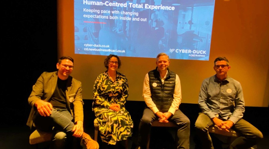
On Monday 29th July, I spoke at the “Untangle the Web” event at Google Campus London. I spoke about responsive web design, why it matters and imparted some real-world experiences from responsive design projects including the challenges we faced and the design decisions we made along the way.
Untangle the Web is a regular mini-conference / meet-up event that sees speakers from across the industry talk about a wide variety of topics. Recent talks have included Rachel Andrew (@rachelandrew) speaking about Web Standards, Laura Kalbag (@laurakalbag) speaking about Design Theory and Lee Simpson (@itsleesimpson) speaking about why user experience (UX) matters.
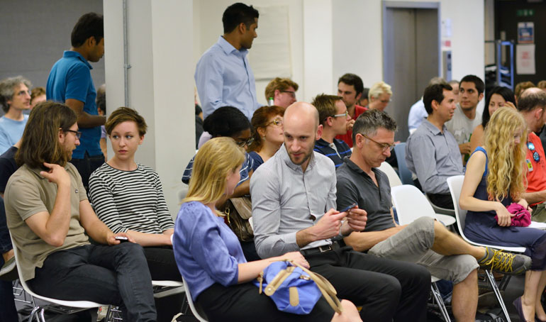
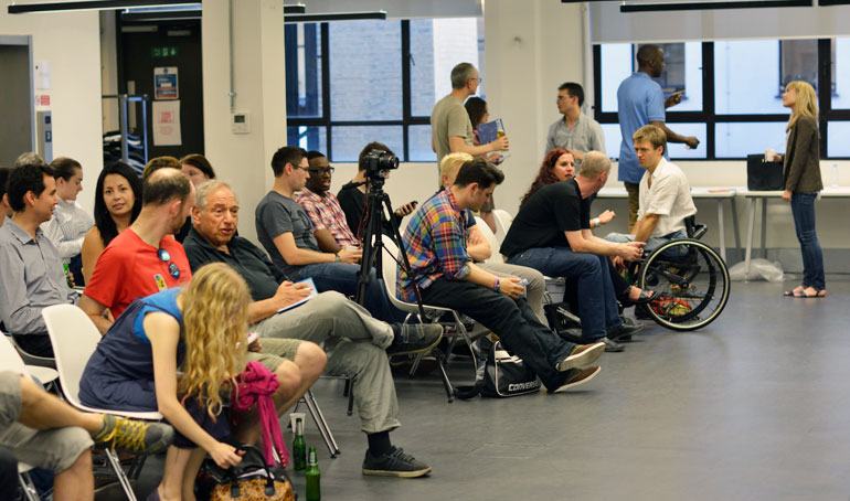
Untangle The Web drew in a crowd of web designers and developers keen to learn more about their trade.
My talk was titled “Adapting to a Responsive Design” and it mainly elaborated on some of the key points in my recently published piece on Smashing Magazine of the same name. Like the article, in my talk I explained how at Cyber-Duck we went about making our own responsive website, what we learnt along the way, why we made certain decisions and how we adapted our approach to UX and design.
While of course not everything we did would be applicable for everyone or every project, hopefully the attendees were able to head home with a better understanding of responsive design overall and apply some of the approaches and techniques I presented to their own responsive web design projects.
Embrace the Unpredictability of the Web
We can no longer predict how people are accessing our websites now, let alone in a few years’ time when the technology people use to access the web will inevitably diverge even further, and perhaps in ways we haven’t even considered yet. Rather than seeing this unpredictability and lack of control as a problem, we should embrace these ‘known unknowns’ and the inherent flexibility of the web. Put simply, responsive web design is about being more flexible and assuming less about our users, from how they’re accessing our websites and what technology they’re using to their environment.
Goals of a Responsive Design
During my talk I broke down this theme of embracing the flexibility of the web into 4 key principles: Improving content parity, speed, future friendliness and accessibility. These 4 principles were the overarching goals we strived towards when producing the new responsive Cyber-Duck website. Each and every key design or technology decision was framed against these goals and whether it would help us achieve them.
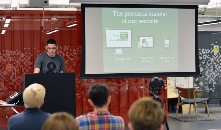
I used Cyber-Duck's own website as a responsive case study.
1. CONTENT PARITY
In this section I spoke about how we should assume less about our users and avoid the trap of mistakenly assuming mobile users don’t want or need feature X or content Y (see Jeremy Keith’s write-up of Luke Wroblewski’s talk at An Event Apart about the Write/Read Mobile Web). By researching and involving the people you are designing for, you can understand more about their needs and motivations and develop a content strategy accordingly. By considering content first, we can define a core experience for all of our users, regardless of how they’re accessing our website. From this base we can then enhance the experience for browsers where possible.
What’s important about this approach is that our content defines the layouts and interfaces we need rather than the other way around.
2. SPEED
Performance affects everyone. I would argue that responsive design is as much about optimising performance as it is about fluid layouts and media queries.
I discussed some of key design decisions we made when producing our own responsive website to improve speed and performance. These included:
- Removing social media plugins such as Facebook and Twitter share buttons.
- Avoiding off the shelf front-end frameworks and instead building a light, custom SASS library (called Hoisin.Scss) that didn’t make any design decisions for us and was flexible for whatever grid or layout we wanted to implement.
- Not implementing a CMS (apart from our blog) as the frequency of edits and type of content didn’t require it.
- Taking a modular approach to JS and CSS to only load what we need, when we need it.
- Optimising JS and CSS using Require.JS / UglifyJS and SASS.
- Choosing images carefully and optimising them manually as well as using tools such as ImageOptim and TinyPNG.
By improving performance we assume less about our users’ connection speeds. A big screen doesn’t necessarily mean an excellent connection (It's just as likely that I could be using my laptop in a coffee shop with a ropey wifi as I could be using my phone at home on a strong wifi connection).
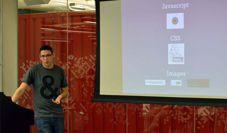
Speaking about optimising performance in responsive design.
3. FUTURE FRIENDLINESS
I spoke again about the unpredictability of the web and how as designers, we need to embrace it. By designing fluid breakpoints based on when your content and interface need them (I.e. when the design is at breaking point!) rather than based on a specific device or arbitrary fixed widths we can ensure our websites are more future friendly. That means when an inevitable new form factor / screen size comes to market, the design will already feel like it is tailored for it.
Other examples of future friendliness include implementing animations using CSS3 so that the experience is enhanced for browsers that support it whilst older browser still get the functionality, if not the eye candy.
4. ACCESSIBILITY
I ended my talk with some quick and sensible tips on improving accessibility on websites regardless of browser or device, including:
- Designing URLs to be human readable.
- Making the purpose of links clear and avoiding anchors that presume the interaction method (such as click here, swipe this, etc).
- Using appropriate input types and attributes on forms as well as not using placeholders as an alternative for labels.
Summary
Speaking at Untangle The Web was a great experience and I hope by sharing our experiences and decisions we have made on a real-world project the attendees gained a better understanding of responsive design and are able to apply some of the techniques discussed on their own projects.
Overall I felt the event was a success, the other speakers (Darren Mothersele, Oliver Legg and Sandi Wassamer) were excellent (I particularly enjoyed Sandi’s presentation on Inclusive Design) and I got to meet some interesting folk.
Thanks again to the organisers of Untangle The Web (Will, Faye and Ross).
A final thank you to all who attended the talk and to Untangle The Web (especially Faye and Ross from Treehouse) for inviting me along and welcoming me to the community – I look forward to the next event!
My slides can be found online on SlideShare: