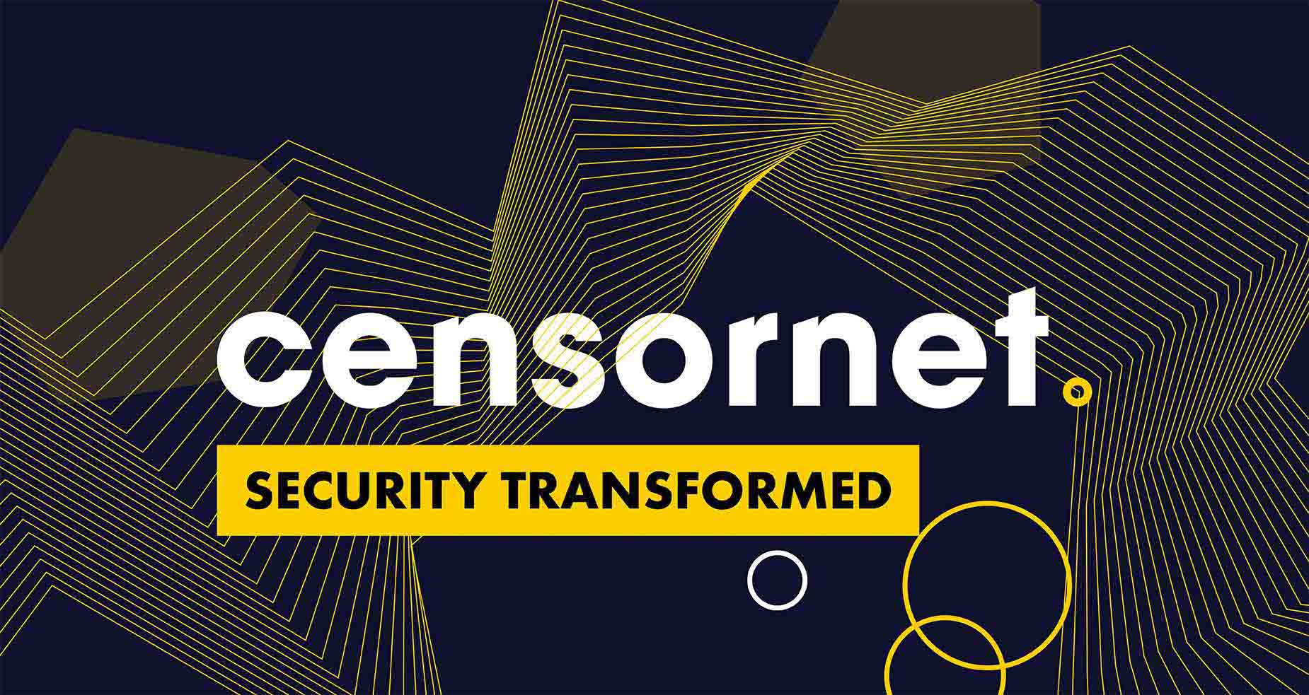
Censornet
A stylish new brand, website and revamped marketing strategy for an industry-leading cloud security provider
Censornet is an industry leader when it comes to security. Over 4,000 organisations use their unique automated cloud security platform to protect millions of users. But in 2018, Censornet wanted to update its brand, website and marketing strategy to communicate a stronger value proposition to customers. Cyber-Duck was chosen to rebuild Censornet’s brand from the ground up, with its customers at the heart of each decision.
57%
increase in enquiries
71%
increase in page views
31%
decrease in bounce rate
Censornet offer a range of unique products in the automated cloud security field. The company is known for its pioneering innovation and commitment to its customers. Censornet’s ultimate aim is to help organisations deliver uncompromised and secure cloud-based solutions.
To deliver on that promise, Censornet needed to revamp its brand, website and marketing strategy to fully connect with its current customer base and possible future leads. It needed a brand that reflected its values and helped to build an undeniable reputation for security.
We identified several aims for the project. The most challenging was the entire brand overhaul. Our team needed to improve how the organisation communicates its proposition to users, and that would come from a user-centric, modern and stylish brand architecture. Our objectives were to:
With Censornet, there were a number of problems with the existing brand and how stakeholders felt customers engaged with Censornet as a company. Our accredited user-centred design process would help remedy those issues.
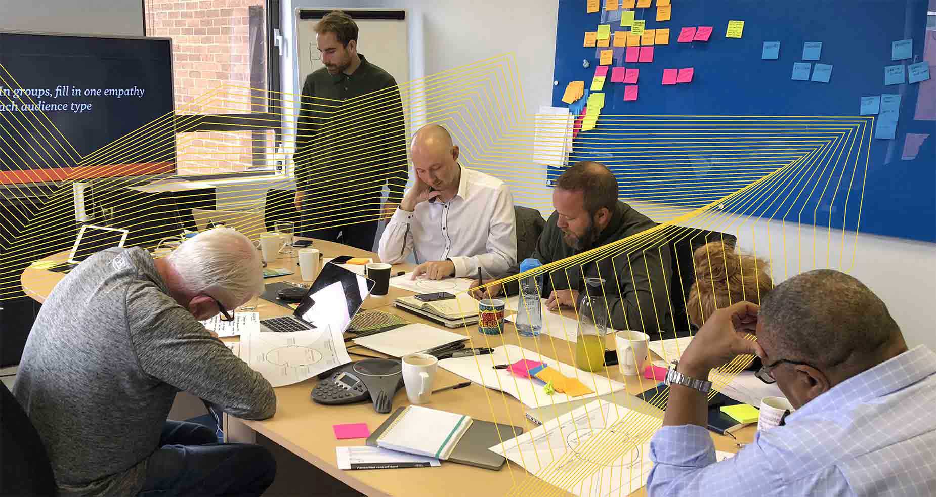
We ran several workshops with Censornet, primarily with stakeholders. Here we used a variety of techniques and exercises to identify the brand and define the ideal persona/user. We saw the existing brand didn’t effectively communicate Censornet’s value proposition to customers. In particular, there was too much content on the site that confused users about the core offering.
Overall, Censornet had difficulty expressing its brand values beyond individual products. It wasn’t clear to customers who Censornet was. A landscape analysis of competitors revealed that other companies within Censornet’s industry also struggled in this regard. As such, there was a great opportunity to refresh Censornet’s brand to make it really stand out from the crowd and meet unfulfilled user needs.
We wanted to give Censornet a new brand identity that was user-friendly through and through. This would allow the company to capitalise on its competitors’ failings. We would do so by overhauling the visuals, creating a new and clear content strategy, defining an intuitive information architecture, and optimising the sign-up process. Our findings from the workshops allowed us to make informed creative design decisions about the new brand.
The new Censornet brand was going to be a far cry from the old one. We wanted to make it both modern and user-friendly and promote the commitment to innovation that drives Censornet.
We drew on the stakeholder workshops to help define the new brand personality. Censornet wanted to come across as agile, trustworthy, dependable and a leader in their field.
With these values in mind, our designers went on to create several possible art directions. To help during this phase, we trialled new brand architectures that would communicate Censornet’s values more clearly to customers.
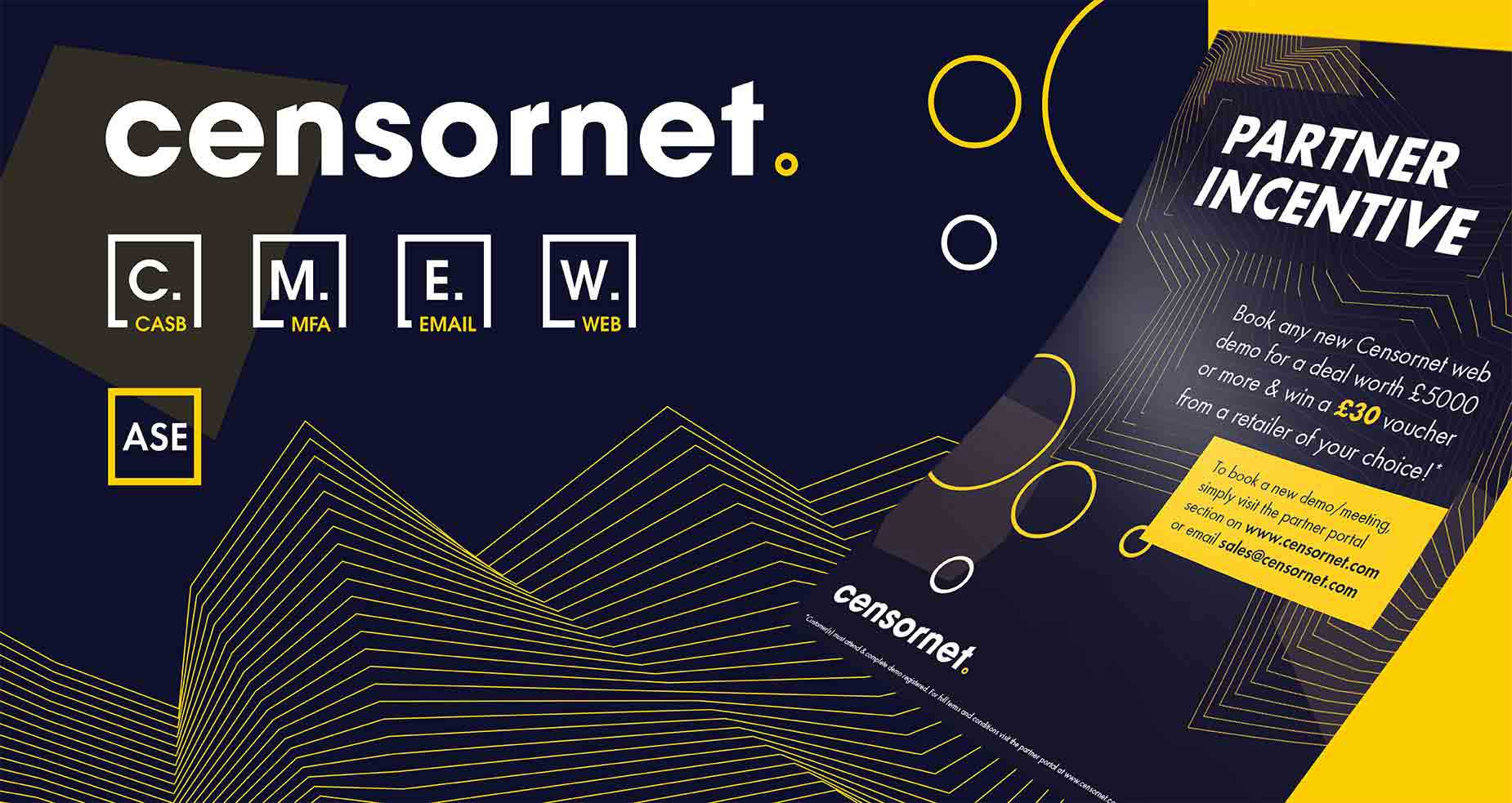
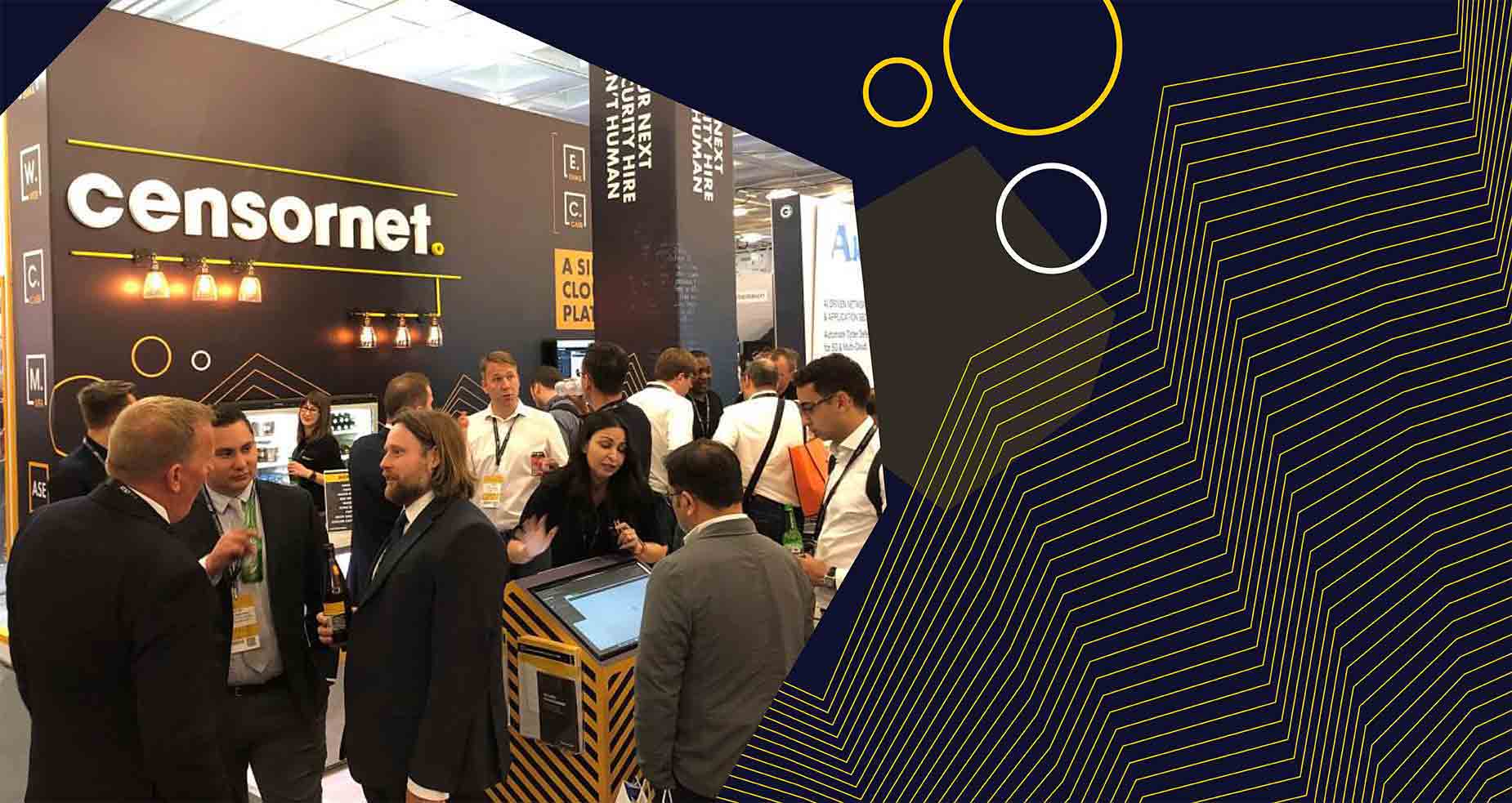
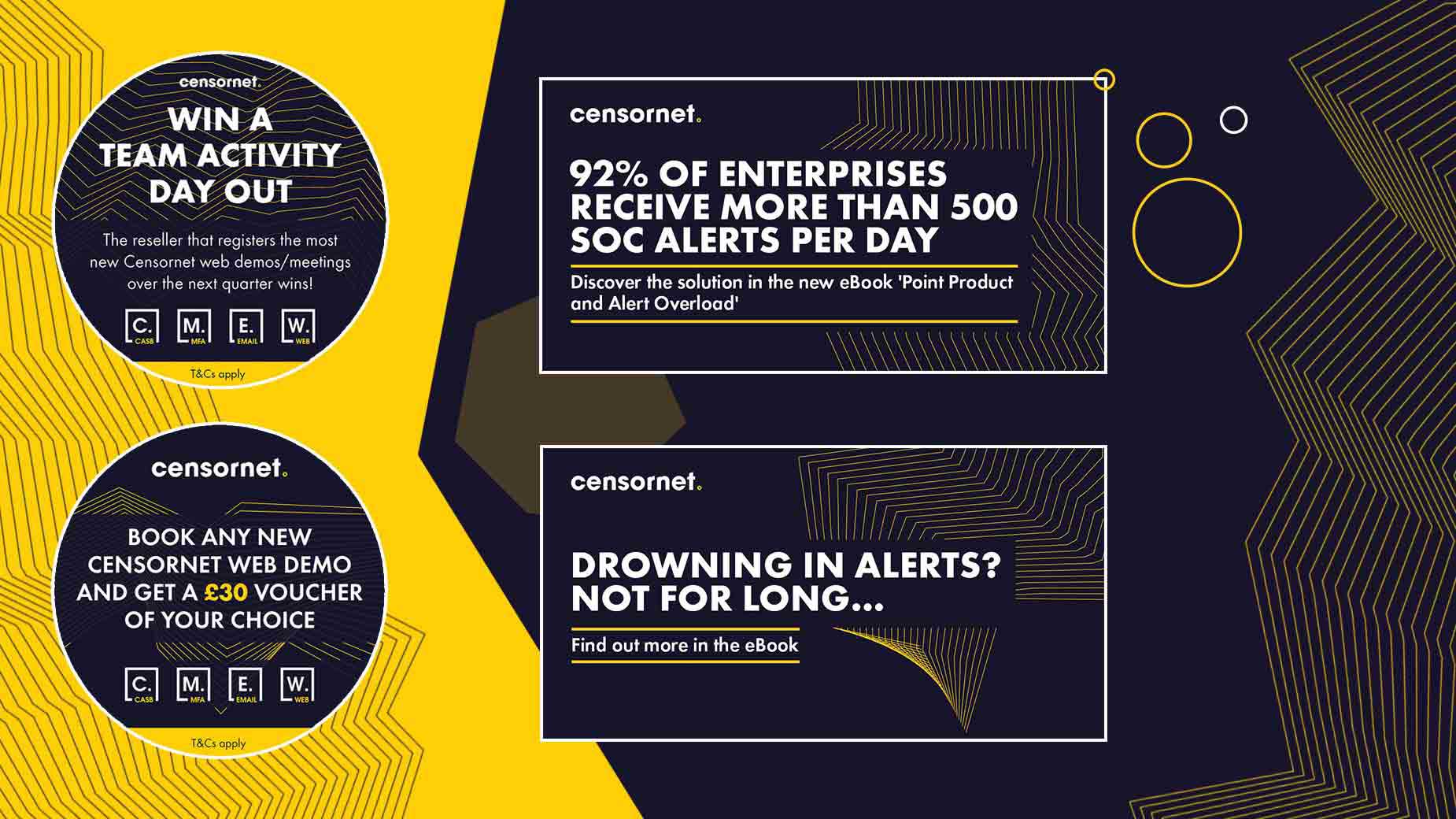
Then, we worked closely with Censornet to agree the new brand and logo, and rolled this out across the entire company. We firstly created a conference event stand, but soon moved on to create everything from business cards to white papers, roll banners to posters and even shelf wobblers.
We then established the brand guidelines and enhanced the brand logic to empower Censornet to achieve its aims going forward.
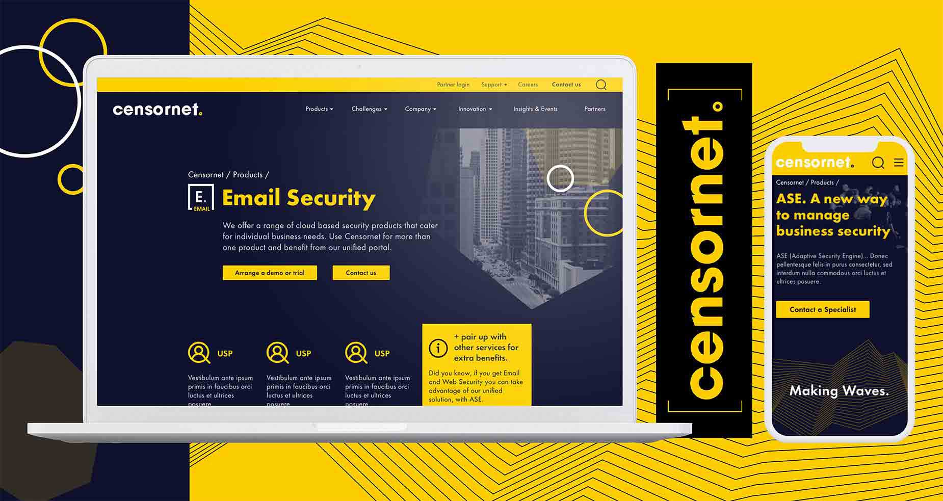
Now that we had the brand finalised, it was time to start work on the new website. This would have to be user-friendly, so it was clear we had to start by defining the information architecture.
As part of our information architecture process, we sat down again with the Censornet team to complete core model exercises. These workshops help align key user needs with business goals, ensuring that any future website delivers a great customer experience that also leads to business growth.
The core model exercises allowed us to plot out user journeys on the main Censornet pages. We noted where users came from, what they would see on the page, and where we wanted them to go on the site.
Similarly, we completed a closed card sorting exercise to sort out the new sitemap.
Combining all the insights we gained from these exercises allowed us to build a more user-friendly information architecture. In future, users will be able to navigate the Censornet website easily and will be more engaged with the content they see.
Ultimately, this should lead to greater growth for Censornet – informed, happy customers are more willing to convert.
The next step was to redesign the entire Censornet website to bring the new brand to life online. We wanted it to promote a user-friendly aesthetic, so to do that we had to first complete a content audit of the existing site.
Drawing on the audit findings, our UX designers recommended improving the call-to-action messaging throughout the website to make it clearer what users were doing. Likewise, we advised Censornet to improve the site search to streamline user journeys. Finally, we recommended spreading media content like videos more consistently across the site to enhance engagement.
Next, we took the findings from the information architecture and content audit stages to build low-fidelity wireframes of the main pages. We tested the wireframes to make sure that users could navigate the site easily and could understand what Censornet were all about.
We then iterated on the wireframes to build responsive web designs that were optimised for a great mobile experience.
Once we had finished the new website design with the agreed art direction in place, we created a pattern library of key responsive templates the tech team could use to quickly build the website. It detailed colours, typography and more to keep the brand and UX consistent throughout the site.
Finally, we also created a content management system (CMS) specification and mapped out the CMS for the tech team. Our CMS will empower Censornet to champion its brand and adapt its marketing strategy to meet the demands of the market.
Another core element of the Censornet project was our marketing audit and lead gen strategy. Our in-house marketing experts analysed the existing Censornet website and marketing material to produce a comprehensive audit report. We detailed key areas for improvement, including SEO and analytics as well as lead generation tactics.
When it came to the analytics set up, we found that 81 pages on the existing site didn’t have Google Tag Manager (GTM), a great tool for optimising analytics. We also saw that cross-device tracking could be improved, and that there were numerous issues with referral sources that were negatively impacting SEO.
Following the audit, we made a series of recommendations to Censornet to help improve their marketing output. By introducing cross-device tracking, fixing the referral source issues, optimising GTM on the website and more, we could help to improve the accuracy of data tracked.
In addition, our lead gen strategy advised Censornet to shift focus on its PPC. We also promoted micro-moments – a strategy that breaks down customer thinking and experiences across the entire buyer journey – to define a new organic and social strategy.
After an intensive project spanning several months, we handed over the new brand and user-friendly web designs to Censornet. Their team went away and began development, and our designers were on hand to assist the developers throughout to ensure the vision was fulfilled.
The new website launched in early 2019, and the new brand is already having a positive impact for Censornet. The modern, stylish aesthetic and user-friendly website, combined with an optimised marketing strategy, has delivered the results Censornet wants and needs.
In the first 12 weeks since launch, there has been a 57% increase in enquiries compared to the same time period before launch. There’s evidence that users are engaging with the content far more, with a 71% increase in page views and 31% decrease in bounce rate. 8% more visitors are now exploring the Censornet website.
57%
increase in enquiries
71%
increase in page views
31%
decrease in bounce rate
Whatever the project or particular challenge you have in mind, we’re here with the right people, process and technology to help deliver the transformation you need.