Compare the Market
UX strategy and design to improve the remortgaging product iteratively
Compare the Market is a UK price comparison service; they are one of the UK’s most well-known brands. In September 2019, they approached Cyber-Duck to lead a design sprint that could solve specific data-driven issues with their mortgage comparison service. The success of this project led to a longer-term partnership, where we redesigned their entire digital mortgage proposition from the ground-up. The result? 80% of users completed the remortgage calculator submission; the target was only 65%
80%
of users completed remortgage calculator
60+
hours of user interviews
200+
hours of qualitative research
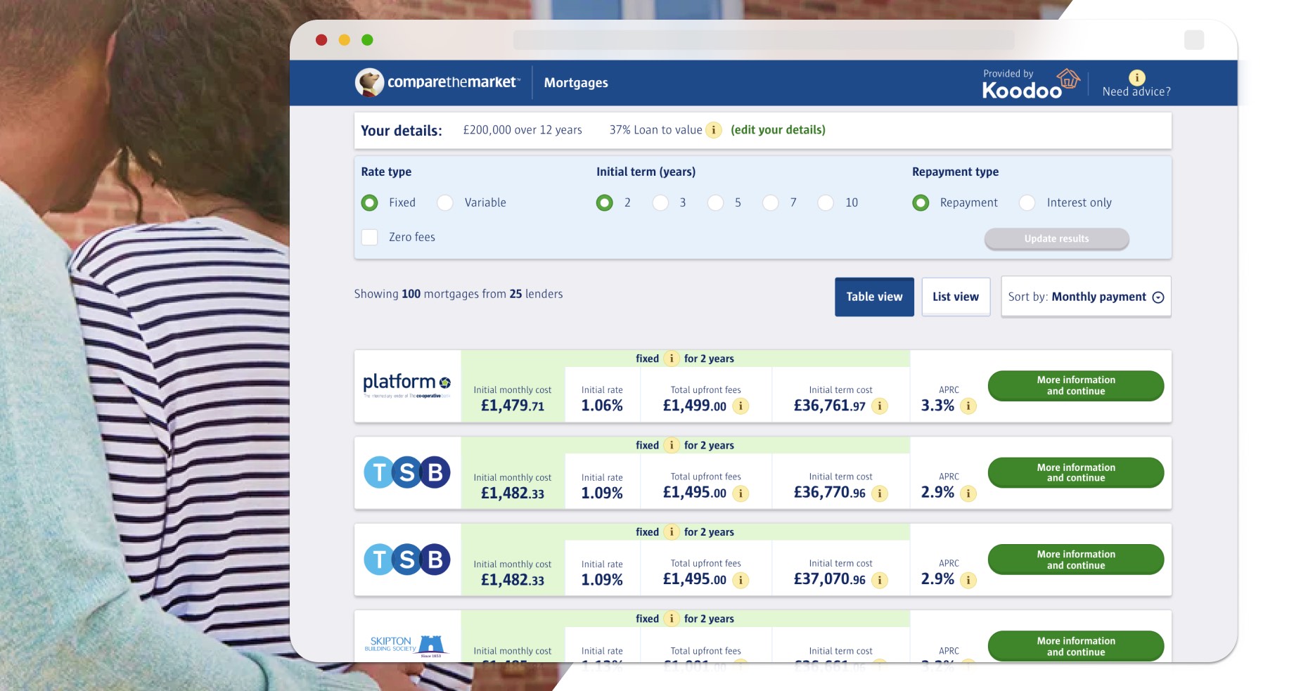
Compare The Market had a vision to create a full end-to-end mortgage comparison service on their website. Customers would provide information on their finances and borrowing requirements; they could then see a range of mortgage options from different lenders, and go on to apply for the mortgage via the website. However, after launching the first version of the mortgage comparison feature, results were below expectations, with many users dropping off without completing the process. Cyber-Duck was approached to help Compare the Market to steer the feature in a fresh, customer-centric direction, helping them to stay ahead of their competition and achieve their business goals.
Initially, we investigated Compare The Market’s analytics and conversion data to identify potential user experience issues and opportunities for improvement. We discovered there was a 50% drop-off in the remortgage journey during users’ form completion.
This measurable metric inspired a joint research investigation, which would inform iterative design improvements. This started off as a short joint design sprint; then, building on that initial success, we formed a longer-term partnership. It was just as important to share our insights with their in-house team as it was to identify improvements.
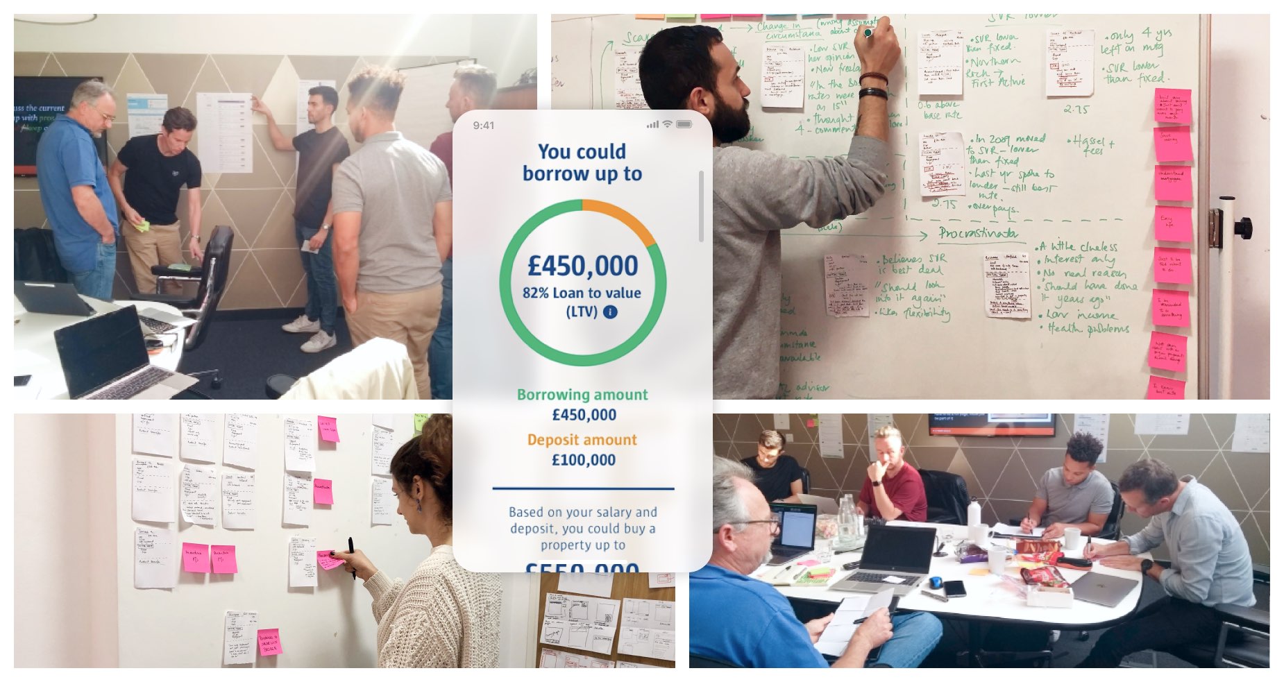
We kicked off the initial design sprint with a design discovery and ideation workshop. Working closely with the Compare the Market team, we articulated our knowledge of their current customers, grouped by behaviour and need types. From this, we crafted proto-personas and empathy maps, backed up with direct and indirect customer research.
The workshop concluded with quick-fire sketching exercises, collaboratively exploring potential design solutions. We evaluated the ideas together and voted on which solutions to explore further through prototyping and testing. Afterwards, we conducted a UX audit on the mortgage search/compare service’s existing interfaces.
Following our initial success, we began a long-term working relationship with Compare the Market. Our team mapped the ideal user journeys for solving the user and business pain points, and designed prototypes based on existing components. This would speed up development and ensure consistency across the whole experience. We carefully considered how the mortgage comparisons journey we designed fitted within the wider workflow of a person looking for a mortgage online.
This process was iterative, informed by usability testing throughout to ensure we were staying on track and meeting users’ needs. We demonstrated that it was easier to find and compare mortgage options quickly with the new design, as users reported that it felt less clunky and disjointed.
Within 3 weeks, we delivered significant improvements to the mortgage search and comparison interface.
The new solution was sensitive to Compare the Market’s existing design system and development team; we ensured that everything was technically feasible and easy to implement.
Our 60 hours of user interviews identified the potential reasons behind the high drop-off rate: apprehension and form fatigue. We prototyped a more streamlined, intuitive and user-friendly journey for all user groups – first-time buyer, remortgage, buy-to-let and mover.
As part of this, we reduced the number of questions users were being asked by 70%, so they were presented with actionable results much earlier in the process.
200+ hours of qualitative research later, we further optimised the user experience over 10 sprints. This included testing tooltips and comparison table layouts. The result? 80% of users completed their remortgage calculator submissions, far surpassing our initial target of 65%.
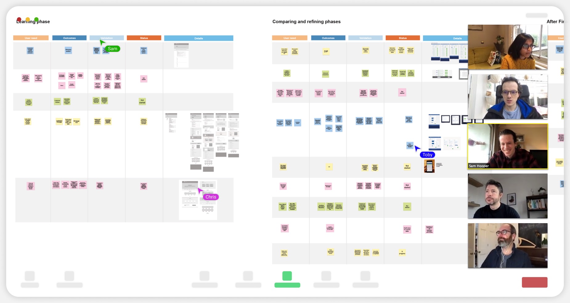
Compare the Market was implementing a UX-driven digital transformation, so it was crucial for us to share insights with their in-house product teams and maintain strong communication every step of the way.
Before the pandemic, we regularly collaborated in their open-plan office with our work visible to critique. We created presentations to summarise our findings and updates for the Compare the Market group. During the pandemic, we organised weekly playbacks, show-and-tells and workshops with their board and designers via platforms including Miro and Zoom.
We documented UX processes and best practice in a digital playbook. This explored everything from how to create research study guides, recruiting participants and managing consent; to conducting ethical research in-line with MRS’ code of conduct; and synthesising and sharing research.
This support has enabled Compare the Market to scale their design and user research practice as their UX team has grown. It’s helped them to replicate testing methods across other group products.
When surveyed, the client rated our communication and knowledge-sharing at 100%. As a result of the value driven by the initial sprint, Compare the Market continued to partner with Cyber-Duck to transform their digital mortgages proposition.
80%
of users completed remortgage calculator
60+
hours of user interviews
200+
hours of qualitative research

The designs look really good. It’s been a really strong effort to be able to share something as soon as Cyber-Duck have.
Product Manager, BGL Group (Compare the Market's parent company)
Whatever the project or particular challenge you have in mind, we’re here with the right people, process and technology to help deliver the transformation you need.