Exclaimer
UX strategy and design for the email signature software
Exclaimer is a market-leader in email signature and disclaimer software; their entire suite of email utilities and solutions serve over 50 million users worldwide, with a diverse customer base. Cyber-Duck was brought onboard to transform their product’s user experience and support their in-house development team.
![]()
As Exclaimer has such a diverse customer base, it’s been difficult for them to pinpoint their key personas, motivations and frustrations, let alone communicate and onboard new customers effectively.
Cyber-Duck delivered the user experience design project by applying agile project management principles; through working collaboratively and flexibly with Exclaimer’s team, we could agree the priorities and deliver elements from their backlog together.
Overall, we aimed to ensure customers became comfortable and familiar with using Exclaimer’s tools quickly. Our objectives were to:
For this UX design-intensive project, we applied an agile methodology based on a series of sprints. We ran the discovery stage first. Our UX Designers facilitated a design strategy workshop with key stakeholders from Exclaimer; we gleaned insights into their business goals, project risks, existing product and research.
Through a series of exercises, we mapped the proto-personas, user journeys and design principles together.
We aimed to identify patterns in users’ need states, motivations, concerns, pain points and ultimately, the outcomes they hoped to achieve.
We validated these proto-personas through interviews with real users; landscape analysis; and interviews with the Customer Support and stakeholder teams.
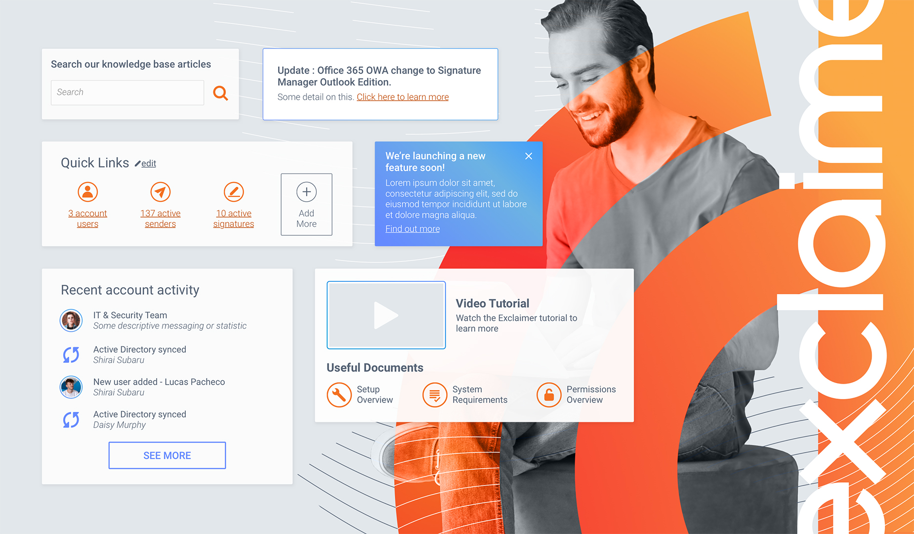
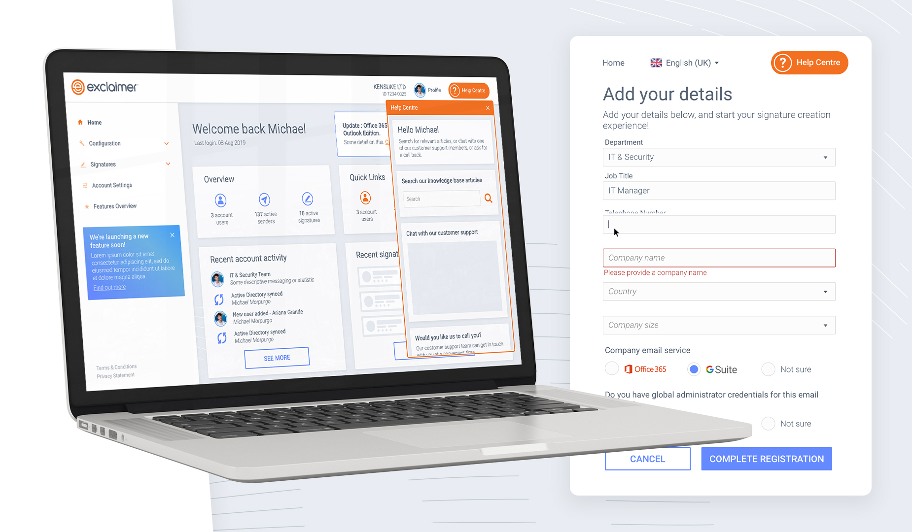
From this, we identified and began to design for the key user journeys, including increasing the navigability through a new information architecture.

We soon realised that Exclaimer’s product was incredibly complex and powerful. There was a lot of valuable functionality; the problem was that it wasn’t surfaced easily or usable by customers. Many would only discover the features relevant to them by calling Customer Support, rather than through the traditional onboarding process.
But we wanted Exclaimer to reap the benefits of our user-centred design approach immediately.
So, we conducted a UX audit into the experience of the current portal and product based on usability heuristics, accessibility, messaging and content.
For example, we discovered that customers didn’t understand how to setup their new software; there was little relevant help on the configuration page. It wasn’t clear how to pull attributes for signature design or what the default options were.
We documented initial ‘quick wins’ and usability improvements that could be implemented while the wider project was being run.
From reviewing Exclaimer’s sales and user profiles as part of the persona creation, we discovered that 40% of their users weren’t from IT. IT tended to be involved in onboarding and setup only; it was Marketing and Branding that would use the signature design product consistently for campaigns.
Yet, the current experience didn’t have much flexibility (to move between steps, for example) and presumed technical knowhow.
Each two-week design sprint focused on a specific user journey; we began with registration journeys and the dashboard home, then moved to configuration.
Within this, we explored how the screens would look and feel through creative art direction; we prototyped key interfaces and interactions, across touchpoints.
But we were constantly focused on how it worked. We moderated remote usability testing sessions with a variety of participants, who reflected the personas we defined. This validated the usability, intuitiveness and effectiveness of the designs proposed.

The final UX strategy and journeys we crafted for Exclaimer streamlined and surfaced the functionality of the product, from registration and onboarding to ongoing use.
Our focus was on creating reusable patterns and components. This ensured the design system we created was scalable; this meant it could evolve as Exclaimer grew.
We passed the final interfaces over to Exclaimer’s team for development and are excited to see the final developed project. Using Zeplin, we created comprehensive functional specifications to explain how each interface was expected to behave.
Whatever the project or particular challenge you have in mind, we’re here with the right people, process and technology to help deliver the transformation you need.