Although smart televisions have been available for the last couple of years, there’s so much more to explore. This year, there’s been a sharp increase in the release of TV apps, tailoring entertainment for the viewer. It’s expected that popularity will go sky high this year. But how can we find a niche, and design to satisfy even bigger screens?
Televisions have been unfailingly popular, adored by millions across the world since exploding onto the market in the early 1950s. It has always been one of the strongest resources for entertainment and information – that is, until the age of the Internet. Despite challenges from online video, gaming and websites, the television remains resilient: the community focal point of our families’ daytimes and evenings.
Many designers and developers are incredibly excited about the Internet of Things, exploring how to integrate all kinds of household items with the web. But, we shouldn’t be so preoccupied with how we can stuff Internet into our fridges. Let’s have a look at applications with a real, popular audience already waiting.
TV Apps: Design Tips
It’s no wonder that the TV app arena is already popular. Unlike the sets of old, the new, powerful processing power and connectivity of smart televisions open plenty of opportunities. Here, I’d like to encourage you creative types, giving initial thoughts about how to deliver the best user experience directly into your users’ living rooms. These tips are inspired by our approach to designing a recent TV app project.
USER MINDSET
Of course, this point could refer to almost any kind of design: every device and every use case will be accompanied by a different user mindset. Designers have to be conscious of the attitude and mood the user is in when using an app. In the case of televisions, the user will likely be relaxed: sitting back or laying down. This comes with a very different set of requirements, in contrast with someone sitting upright at a desk. Their ability and willpower is instantly at a low, simply because they want a relaxing experience. This means we have to get the experience right – with a lot less of users’ patience to play with!
DISTANCE & TEXT SIZE
All interfaces in your design need to be tried and tested using the ten foot rule. Yes, it’s exactly what it sounds like: stand ten feet away and see if you can read the content of your app. Even then, you may be blessed with great eyesight, so check with multiple people to ensure readability. But remember, legibility is not just about text size; also think about colour contrast, and the fontfaces that you use.
REMOTE NAVIGATION
During production, we were fortunate to work with an advance release testing TV from the LG 2015 range, which has since been launched. This range includes a great, almost mouse-like way of moving the cursor on the screen, similar to a Nintendo Wii. But, it came with a wide range of challenges from the sensitivity and natural movements in the wrist when pressing the buttons on a remote. For this type of remote, you will need to make your hit states on buttons as large as possible. Again, test, test and re-test with a diverse range of real people.
Most TVs have the typical four-way navigation, with an enter and back button. Ensure your app can cater for this by laying out your screens in a way that reflects a logical flow between the elements. So, when the right button is pushed, the active state needs to move to the next logical element. This can become tricky in some interfaces, so I recommend that you take a look at the TV guidelines. They will often provide examples of interfaces that work well and explain the logic of this interaction method.
RESOURCES & ASSETS
When producing your designs, it’s important to bear the final resolutions you’re working towards in mind. As with any platform, begin with comprehensive research and review the relevant design and development guidelines to ensure assets are produced at a high enough resolution. These documents are comprehensive yet brilliant, and reading them upfront will make your life much easier.
SIMPLICITY
I strongly believe that a simple design is a better design, more often than not. I would recommend limiting the initial functions of your app and focus purely on the Minimum Viable Product (MVP). This will create a better experience for your users, as the team will focus on making the most important features amazing to use. Cramming too much under-developed functionality can ruin any app idea quickly.
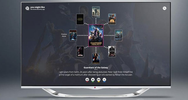
At Cyber-Duck, we love coming up with different ideas based on everyday challenges (in and out of the office), and jumping straight in to try out a digital solution. Recently, I was inspired to produce a great little app purely by my own experiences. It takes the API of a popular film-focused website, utilises their recommendation engine and presents the data in a beautifully simple interface. I’ll uncover the process behind developing ‘You Might Like’ – showing how some of these ideas translated in practice.
You Might Like the Film Discovery App
PROBLEM
I am a self-confessed film geek. To be honest, I’ve seen far too many films and I can’t be alone – with subscriptions to streaming services like Netflix or Amazon Prime rising, thousands of titles are at our fingertips every night. So, finding great new films is getting harder and harder, and there isn’t a simple solution. For example, I’m an avid Netflix user, and enjoy the simple, user-friendly recommendation engine at the core of their service. But, it’s restricted to the films that they offer.
The Internet’s film giant, IMDb is the best data source I have found for suggestions. They offer a huge range, connecting films together based on a variety of topics. But, I was frustrated with using their website, as there is no easy, fast way of browsing this data and quickly finding a film suggestion… and that’s where my idea sprang up.
STRATEGY
We harnessed our experience from working on TV apps with clients, turning our attention to solving this problem. Leading previous projects focused on entertainment had already opened up some valuable insight into TV users’ behaviour, via our user-centred research process.
Producing for TV requires a significant amount design experimentation and thought about the user mindset, as described in the tips above. We decided the app had to be simple, allowing the users to quickly move on a journey through related titles without having to trawl through pages of information for each film. Utilising the IMDB API, we purely focused on transforming the usability of the recommendation engine. Fitting the relaxed TV mindset, the user interface (UI) had to be designed so users could power from screen to screen with minimal movements. Our solution requires the user to tap a direction that moves them to the next screen, so they can flick between films with the click of a single button on their remote.
OUTCOME
We created a simple user journey, to move people quickly from a preferred film (that they’ve enjoyed in the past) on to a new suggestion, informed by recommendation data. ‘You Might Like’ can eliminate that inevitable situation where you stare at your DVD collection, Netflix account or Amazon store, hoping for an idea of what to watch next.
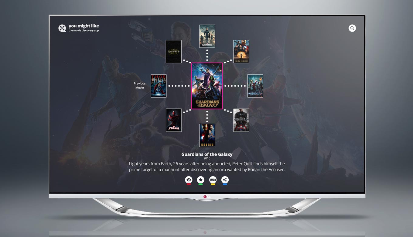
Here's a sneak preview of You Might Like. The TV app will launch soon, on multiple platforms.
You Might Like is close to launch, and will be available on the LG TV app store. We have a great roadmap waiting for you – the app will be released on more platforms, alongside a potential web version. Through integration with more services, we could even go beyond picking your next film, by providing the content with various on demand services, retailers, or including up-to-date cinema listings.
We’re convinced You Might Like can choose your next favourite film. Check back for updates about the launch, and get in touch to find out more about our TV app design services.
