
Have you ever started to read an awesome article and been obstructed by a ‘Continue Reading’ button? Used by the Huffington Post and Mashable, it’s a regular user interface (UI) pattern on the web these days. These big name sites must have a reason to stop users reading the content they’ve requested. So… what’s going on?
It’s official. The UK ‘has never been more addicted’ to smartphones. Let’s face it. We all struggle to put down our phones before bed – for good or ill. Our dizzying array of social media is the biggest temptation. That’s where I’d like to begin my tale...
Last week, I was in bed trying to sleep (unsuccessfully!) when I tapped a Mashable article on my smartphone about #nope animals in Australia. That’s dangerous enough. My wife often regales stories of me sitting bolt upright in the middle of the night – like a scene from The Exorcist - declaring there’s a horde of spiders chasing me. But on this occasion, I threw caution to the wind. Preparing myself for nightmarish creepy-crawlies, I was ready to read.
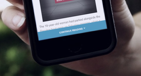
But Mashable disagreed. I’d have to hit ‘Continue Reading’ within the article to actually see most of its content. Seriously? If I’d tapped the link already… why should I need to tap AGAIN to read the content that I’d already chosen to see?
'Continue Reading' buttons now appear across many online publications.
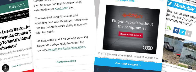
Suddenly, it was everywhere. The New York Times, Huffington Post and Quartz also asked for that extra tap to read the entire content of a page. This meant ‘Continue Reading’ had officially become a UI pattern for mobile experiences. It annoyed me enough to investigate further.
What Are These Buttons?
I think it’s important to clarify something right off the bat. ‘Read More’ links have been used in a different context for a long time. They are employed as a text link or button when users have seen an excerpt of an article and want to continue, on desktop or mobile.
Is the 'Continue Reading' button bad UX for mobile?
I’m specifically talking about the new, limiting experience offered for mobile users. When they are already on an article page, a portion of the content is hidden. It would only appear when they click on a button to reveal it below. To avoid confusion, I refer to these as ‘Continue Reading’ buttons. Right, let’s move on.
Love or Loathe Them… What’s the Reason?
So why has Mashable employed ‘Continue Reading’ buttons? It seems like a strange pattern that stops users from receiving the content they’ve explicitly asked for. But, they’re big publishing players so they must have a good reason. Question is, what is it? After scouring the interweb, there’s some interesting reasons raised for these buttons:
- Robot defense – creating a barrier against content scrapers that are looking to steal content.
- User intent – asking users to click buttons confirms their intentions on a page – good for analytics purposes.
- Page load – showing less content initially = quicker time for users to download.
- Information scent – complying with information foraging ideals, ‘Continue Reading’ buttons hint at more great content being just a click away.
- More context to social users – only using these buttons if users clicked from social media posts that feature content snippets. This gives users the option to reject the article and get back to their social feed quickly if it’s not exactly what they want.
- Article mimicking a homepage’s content discoverability – by going direct to the article, users miss other content otherwise found through the homepage. This content is now found under the ‘Continue Reading’ button. It decreases bounce and keeps users on that site.
- Access to other content with less scrolling – ‘finishing’ the article earlier means that users who aren’t enticed by that article can see what’s next, without having to go through all that pesky content.
- Adverts – finally, and unsurprisingly, comes the big A. Adding a ‘Continue Reading’ button increases chances of users seeing ads that appear after the article.
Hide & Peek…
So, what do I think? Of course, hiding content is nothing new. In fact, ever since responsive design has been here, it’s de rigueur in a lot of mobile design. That doesn’t necessarily mean it’s the right thing to do. The obvious example of hiding content for mobile is navigation… do we hide behind a dreaded burger menu, show a partial menu, or use more screen real estate to get a full menu to show? Choices, choices! With large navigation systems, hiding may seem like the only option. But as the Nielsen Norman Group recently reported:
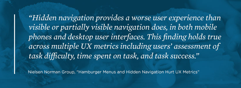
Of course, I’m not going to claim that this report is definitive evidence that the ‘Continue Reading’ button is bad UX. The research covers nav, not content. However, it demonstrates that hiding the means to find content is bad. So it’s not a massive leap to believe that hiding content when you actually get to the content page would be bad UX too. Barriers for barriers sake methinks.
Page-Load: A Reason to Believe
Overall, the theories I’ve found are interesting. But in my mind, they are not even mildly convincing. But, there’s grains of user experience thinking in there – especially with reducing page-load. Because of this, I feel the buttons could be justified sometimes – especially in a scenario where there’s a large number of images. For example, Google Images implement a sort of infinite scroll/pagination/continue reading button hybrid that works well.
But, other justifications for buttons in text-based articles seem more about the business than providing user value. In my Mashable example, ads feel higher in the content hierarchy - more important than the content. It compounds this idea – like a step-back to old-skool Web 1.0.
User experience designers must aim to balance the needs of users and stakeholders. But when it comes to the coin toss, a user-need can trump a (seemingly) business-need nine times out of ten. Giving the user what they want instills trust in the product. This grows a willingness to use that product (and company!) more in the future. Let’s face it, keeping the long-game in mind is key in today’s business world.
As Ever, Testing Is King
It’s worth noting that whatever I say is up for debate. I’d love to see any usability research exploring either way – as many scientists say; being wrong raises more questions, so is just as exciting as being right!
But what do you think? Are you a user that loathes or likes this pattern? Are you a UX designer who’s tested this pattern and what results did you find? I’d love to know, so get involved and tweet us.
To sum up my feelings… ‘Continue Reading’ buttons are like going to shop at catalogue stores. They are unnecessarily obstructive, have too many steps and should be avoided as much as possible. Saying that, well done to Mashable who regularly convince me to read articles about things that give me night terrors. Those catalogue stores couldn’t do that!
