Here at Cyber-Duck, we are big advocates of responsive web design (RWD). It is a future-friendly approach that ensures that your website assumes less about your users, from their connection speed to their screen size. When implemented well, the result is a website that looks and (more importantly) works great across any device or browser.
As you’d expect, we’re always looking at and sharing what we think are clever examples of responsive design patterns and implementation between ourselves here at Duck HQ. Below we have compiled a list of our favourite examples of responsive web design in the wild (in no particular order).
THE BOSTON GLOBE (www.bostonglobe.com)
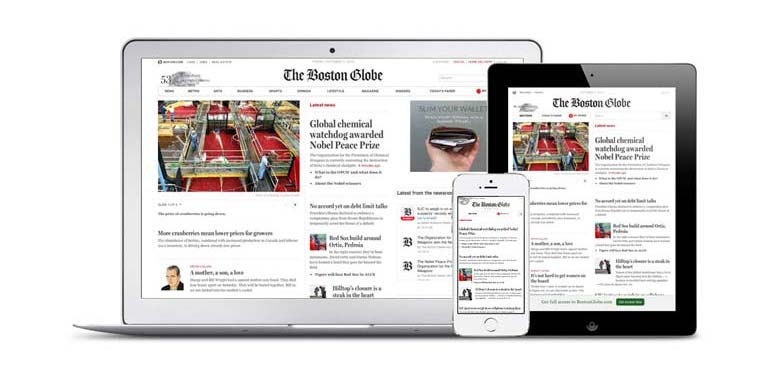
The Boston Globe was an early adopter of responsive web design and became somewhat of a poster-child for the technique, going mobile friendly back in September 2011. The Web community quite rightly heaped praise onto it as an early example of a large-scale website taking a mobile first approach to design.
WORLD WILDLIFE FUND (www.worldwildlife.org)
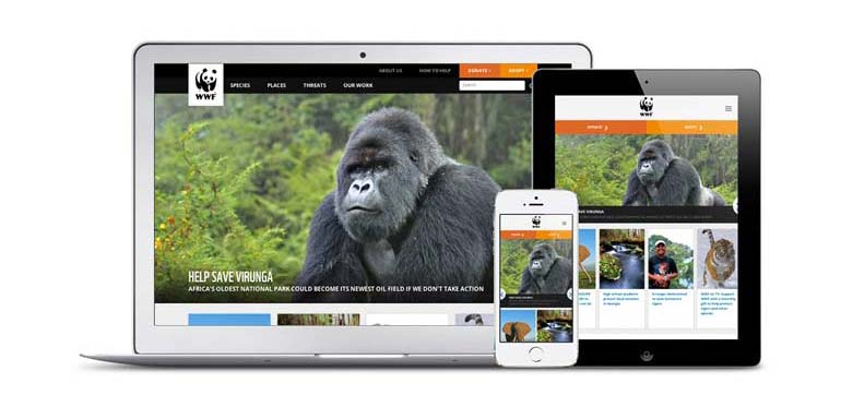
The World Wildlife Fund launched their new website back in August, 2012. The overhaul modernised WWF's online presence, highlighting the beauty of the species and places WWF works to protect through powerful and engaging imagery, thoughtful navigation and rich content.
MICROSOFT (www.microsoft.com)
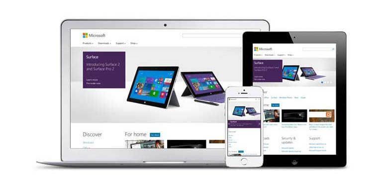
Microsoft adopted a responsive web design for their homepage in October 2012 and were one of the first of the truly large tech corporations to make use of the approach. The Microsoft.com team reportedly built tools, guidelines, and processes to help localise everything from responsive images to responsive content into approximately 100 different markets. As well as building instrumentation to track the behaviours of their users on multiple axes, they created a device lab to test the page on a multitude of devices and adapted their CMS to allow content strategists to quickly manage content on the website.
BARACK OBAMA (www.barackobama.com)
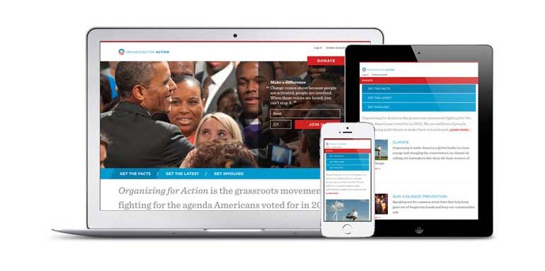
Released in November 2011, BarackObama.com was launched as a focal point for the President’s 2012 US General Election campaign. It was the first major political campaign website to adopt a responsive web design and has since been used to promote the Democrat Party's political stances, reaching mobile, tablet and desktop audiences. Though when originally launched, the performance of the website left something to be desired, weighing in at over 4MB on mobile and with enough scrolling to give even the most hardy of thumbs a decent work-out. Since they have worked to improve this, by progressively enhancing the experience by loading in extra content post-page load via Javascript (though the site is still fairly heavy on mobile bandwidth which we’re sure they’re looking to improve upon).
SKINNY TIES (www.skinnyties.com)
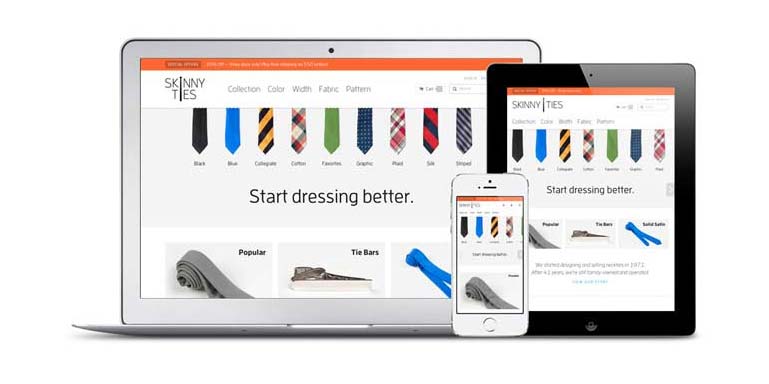
Launched in October 2012, SkinnyTies.com is an excellent example of a responsive e-commerce website. Within the first month of the responsive re-launch, they were achieving record sales with 42.4% revenue growth on all devices. The online store was produced to include high quality photography without sacrificing loading time - an initial page load was actually 63% smaller than on their previous website. Proving that responsive design is more than just a clever, fluid layout, this website allows the user to interact using touch gestures such as swiping when using the website on a touchscreen enabled device; a great example of progressive enhancement.
THE METRO (www.metro.co.uk)
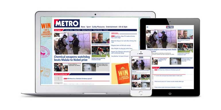
Launched at the end of 2012, the Metro.co.uk was among the first UK newspapers to completely replace their old fixed-width website with a responsive one. At the time of launch the Metro was reaching 500,000 app users on iOS alone. Alongside the responsive website, they also launched an Android digital edition to reach more of their potential mobile readership. Metro also controversially migrated their custom-built CMS to WordPress as part of the re-launch. Perhaps one of the more interesting aspects of the Metro responsive website is how they handle advertising across a variety of screen-sizes, with typical leaderboard and MPU display ads on desktop, changing to smaller and less intrusive ads on mobile.
GOV.UK (www.gov.uk)
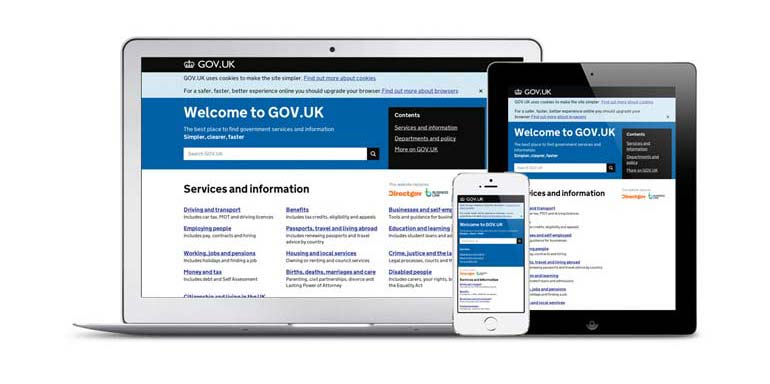
In January 2013, GOV.UK was launched, uniting and simplifying how government delivers services online by replacing disparate resources such as Directgov and Business Link. What is truly impressive about the gov.uk / GDS project is how it has provided a framework of user-centred-design thinking for how all public services are delivered online, from your local council to the DVLA. As cabinet minister Francis Maude even stated:
“As we reform the delivery of public services, they are designed around the needs of the user, rather than has been far too often the case in the past, being designed to suit the convenience of the government.”
The responsive gov.uk website caters for its ever growing mobile audience (45% of e-petition signatures coming from mobile devices). The overall goal of the website was to give an enhanced and consistent user experience for all branches of government. As such, this responsive website means that the government can iterate their services much quicker, and thus can support it far more time and cost effectively. The website won the Design Museum’s coveted Design of the Year award in April 2013.
ENGADGET
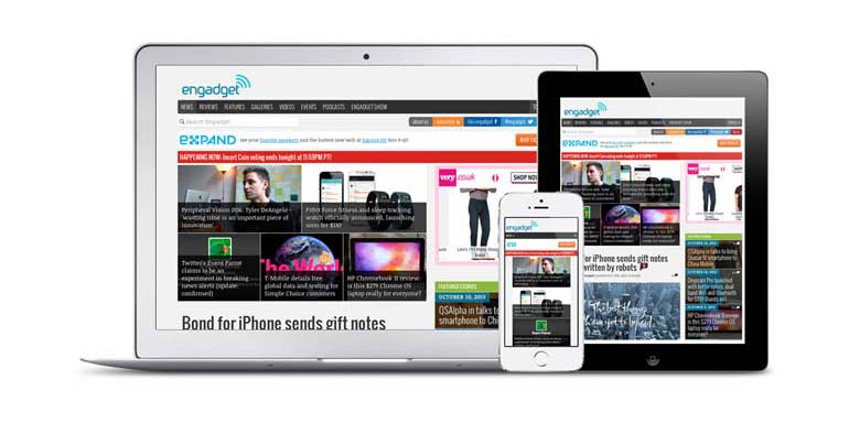
The consumer electronics and gadgets review website is one of the best examples of a large tech blog becoming fully responsive, which it achieved in November 2012. The Engadget team had an aim to produce a website optimised for viewing on mobile, tablet and desktop as well as speeding up loading times on any device. By simplifying and streamlining the website, it now incorporates high definition photography with 50% faster loading times than before.
SMASHING MAGAZINE (www.smashingmagazine.com)
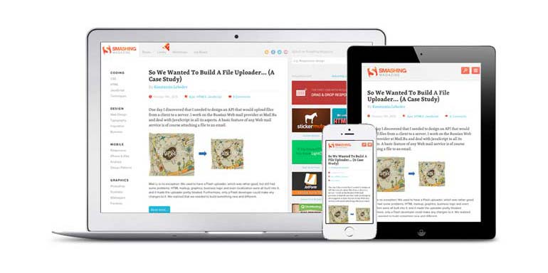
In January 2012, Smashing Magazine rolled out their revamped responsive web design. As web designers, the website naturally holds a special place in our hearts, as a fantastic and respected resource for cutting-edge design and development news. The website was launched with six unique layouts, split by 5 breakpoints based on the needs of the content rather than devices (AKA device agnostic). The emphasis of the design was to provide accessible and readable content on any device; their articles now offer a great reading experience at every screen resolution.
DCONSTRUCT (2012.dconstruct.org)
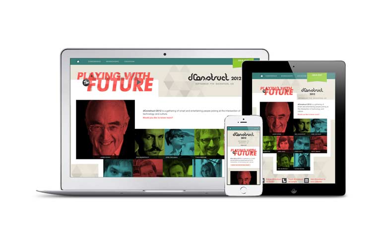
The 2012 dConstruct conference website is a personal favourite here at Cyber-Duck. Being designed with a mobile first approach, the website was designed to carry as little weight as possible despite including video footage and plenty of images. It avoids having to render large images by ensuring the layout changes so that the images (200x200 max) are viewed side by side as the screen size increases, negating the need for bigger images.
The images themselves were cleverly optimised with selective blurring and by applying a monochrome effect the speaker images weigh in at a slender 12kb on average. For the video footage that features on the speaker pages, conditional JavaScript dictates that the video is only embedded when appropriate and a link to the video is shown the rest of the time: Another great example of progressive enhancement in the wild. Bravo!
BAM SUSTAINABILITY
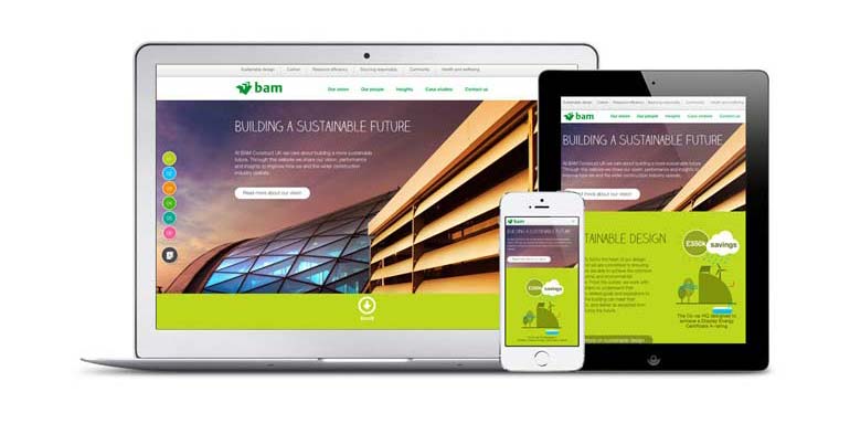
In September 2013, the team at Cyber-Duck created a microsite for BAM Construct UK. The purpose of the website was to communicate BAM’s knowledge and successes in being sustainable in the construction industry; it displays the key findings of BAM’s own Sustainability Report, of which you can download on the website. The microsite uses animations and info-graphical illustrations to highlight key information in the report as the reader scrolls the page. The responsive website scales to fit any device from small screens to big. On mobile and tablet, smaller, lighter images are loaded and animations are omitted to ensure faster loading times and better hardware performance.
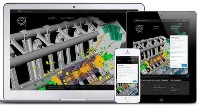
CERN (home.web.cern.ch)

In March 2013, CERN launched a new, responsive website complete with a revamped content strategy. CERN as an organisation has a history littered with major scientific achievements and is perhaps most notably known for its experiments with the Large Hadron Collider (LHC); smashing sub-atomic particles against each other at mind-boggling speeds to advance our understanding of physical laws.
What is less publicly known about CERN, is that it is the birthplace of the World Wide Web (Sir Tim Berners Lee worked there) and as such published the first website using HTML in 1993. It is therefore fitting that 20 years later CERN re-launched their website with a responsive design that demonstrates the awe-inspiring experiments and collisions taking place in real-time.
If you would like to find out more about responsive web design and how you could maximise your website’s performance across all mobile devices, get in touch today!