The UX team and I recently went to the Royal National Institute of Blind People to learn about how to make our digital experiences more accessible to those with visual impairments. Here's what we learned...
In May 2019, we celebrated the 8th Global Accessibility Awareness Day (GAAD), the purpose of which is to get everyone talking, thinking and learning about how we can make digital experiences more accessible and inclusive for all.
So, to learn more we took the Cyber-Duck Design Team to the Royal National Institute of Blind People (RNIB) to receive training on accessible and inclusive design from the amazing Dr Lori de Bon, an Accessibility Specialist Evaluator at the RNIB.
It’s important to remember that there are a broad range of disabilities that can affect vision, hearing, speech, movement and cognition, but during our training, we concentrated on visual impairments.
The whole day included an introduction to the broad range of visual impairments that exist. We got to use some tech to help us experience some of these conditions for ourselves, and we were also able to conduct two usability tests on one of our recent projects with two participants: one blind and one partially sighted. What we learned was invaluable and we strongly recommend any Design Teams wanting to learn more about accessibility to attend this training!
Why accessibility is so important in website and app design
Let’s start with some stats… People with disabilities are the largest minority group in the world, totalling 1.3 billion, with over 13.3 million in the UK alone. To put that into context, ignoring every disabled person in the UK when you design would be the equivalent of ignoring everyone in the UK with brown eyes!
There are 2 million people in the UK that have a sight impairment, and 4% of them are totally blind. In addition, the most common sight conditions affect vision in very different ways.

The images above demonstrate a variety of visual impairments. Clockwise from top-left: Age-Related Macular Degeneration, Glaucoma, Cataracts, and Diabetic Retinopathy.
Another common visual impairment is Colour Vision Deficiency (CVD) - a problem with the cone receptors at the back of the eye that affects 8% of men and 1% of women. Something we learned was that there are several different types of CVD, again affecting vision in very different ways. Below are some examples:

Examples of, clockwise from top-left: common colour vision, deuteranopia (where people have difficulty distinguishing red, green, yellow and blue), monochromacy (where people can't see colour) and tritanopia (where people have difficulty distinguishing blues and greens).
As Designers, we need to consider and empathise with people suffering from these conditions, and what better way of understanding all those impairments than trying to see the world through the eyes of someone that has a visual impairment?
To do that, Dr Lori invited us to try special glasses that simulated different conditions. Suddenly, easy tasks such as sending a text message turned into a complex mission (or even impossible). Interfaces became blurry, obscured by black dots or the text simply disappeared completely.

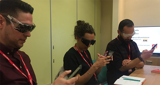
Our UX team, including Matt, Cristina and Tod, all tried the visual impairment glasses on to see what it's like to interact with digital products with reduced abilities.
We also tried some apps that use AR to simulate various conditions, such as Via Opta Sim, EyeWare, and the Chromatic Vision Simulator. With the help of all these tools, we could understand how some of our design decisions on graphical interfaces can quickly exclude people with sight impairments.
A way of simulating the experience of a blind user is to use the Screen Curtain function on your devices. This will black out your screen but allow you to navigate around with a screen reader.

Augmented reality allowed the UX team to experience the world through the eyes of a visually impaired individual.
Visual enhancements for assistive technology
Now the team had an idea how some of these conditions impacted users, Dr Lori showed us how they interact with a variety of tools to enhance digital experiences.
Screen readers
Partially or fully blind people use screen readers, a Text-To-Speech (TTS) engine to translate on-screen information into speech. Jaws (paid for, works best on Chrome) and NVDA (free, works best on Firefox) are the most common screen readers on Windows, and VoiceOver and Speak Selection on Mac and iOS (which are built in as standard, with VoiceOver for blind users and Speak Selection for visually impaired users). Android users prefer TalkBack (which is also built in). On mobile, 80% of screen reader users use iOS.
These users never use a mouse; they only use the keyboard to navigate web pages and content, tabbing through elements according to the structure of the HTML, often focussing on the different heading types, H1, H2, H3s etc. Users can also navigate via buttons, links, and paragraphs, so it is fundamental that each page is built following a logical structure. We must also be careful to avoid dead-ends; we can do that by giving users who tab to navigate a page a clear way out.
When we watched a blind user completing some tasks on a specific website’s page, he quickly skimmed through all the H2s to get an overview of the page’s structure (therefore, if you jumbled up how you used H2s and H3s he would get confused very quickly), he then found content he wanted, and screen-read that. Side note: On screen readers, it’s possible to choose the speed of the voice; we struggled to keep up at 35% speed, but blind users frequently increase the speed up to 95%!

Screen readers come in many shapes and sizes. Making sure your digital experience is screen reader friendly is crucial for accessibility.
Another thing we learned was that users using screen readers and magnifiers actually end up experiencing almost 100% of your content, unlike an average user who tends to skim over a lot of what is on a page. We need to consider that when we make content – everything needs close attention paying to it so that all users benefit from concise and relevant content.
Some tips for designing for screen readers:
- Use Skip links. These are hidden links at the top of each page that can allow screen-reader users to find the most important parts of a page and jump straight to them without having to go through the whole page.
- Aria Tags are very important! Use these to explain images and functionalities on a page. Be careful not to go overboard though; only explain things that are going to be useful to the user.
- Errors in Forms: inline messages don’t really work. You can create error Skip links that are hidden at the top of the page that explain errors and allow users to jump to the correct part of the form.
- Menus and sub-menus must be clear and should explain if they are collapsed or expanded.
- Screen reader users find it easier to browse through websites using the search bar. This can become difficult in cases when the search bar collapses into an icon only (click to open).
- Pop-up boxes can cause confusion during the navigation, as the screen reader reads everything on the page in sequence, so make sure focus shifts to the pop-up otherwise the user has to go all the way through the page to get to it.
Screen magnification
Screen magnifiers help people with impaired vision to navigate on websites and apps, magnifying the screen according to their needs. Users tend to not use the browser zoom, as when they do they often can’t find the cursor, drop downs don’t fit on screen etc.
With a magnifier, users have more control; they can choose the level of magnification and how the area will be displayed, as demonstrated in the images below.

Above there are examples of magnified screens to make it easier for visually impaired individuals to engage with content.
On desktop, the most common screen magnification tools are ZoomText, Supernova, Magic, and Magnifier on Windows. On mobile, Zoom and Magnification for iOS and Android respectively.
Overall tips for designing for magnification users:
- Avoid large areas of whitespace as users can easily get ‘lost’ or not see content that’s off the screen.
- Elements that are out of alignment are more difficult to follow so have repeating patterns so users can learn layouts and know what to expect.
- Pop-ups are very problematic with magnification: as soon as you move the cursor to go to the pop-up, it disappears!
FOCUS AND CURSOR OPTIONS
Focus and cursor options can be enhanced as well, helping people to identify where they are on the screen more easily.

Cursor and focus examples to help promote accessibility.
Colour schemes and enhancements
Users can change the colour scheme, invert brightness or add colour layers, according to each condition. Changing contrast or colour scheme can also be beneficial for cognitive impairments, such as dyslexia, where a pastel background behind the text helps with reading; many dyslexic users are sensitive to glare, making the words swirl or blur together.
Tip: It’s important that in the original design is good in terms of tonal contrast to prevent things fading into one another. The relationship between the colours is more important than the colours themselves. WCAG AA guidelines stipulate the contrast ratio should be 4:5:1 for text that is less than 14 pt (bold) or 18pt (regular).
Some more general visual tips for accessible design
- Clear and simple sans serif typefaces are easier to read – Body 14px to 18px WCAG recommended
- Use text effects carefully as some, like drop shadow, can make text more difficult to read
- Using italics or All Caps should be avoided. It is difficult to recognise the shape of words
- Titles and headings should be bigger to help them stand out for users with learning disabilities
- Boxes are a good way to separate different parts of your information for users with learning disabilities
- Use images to support text for users with learning disabilities
- Provide text alternatives (Aria tags) for blind users
- Make sure colour contrast is high (4:5:1 ratio)
- Never use colour alone to convey information or indicate action
- Never use images with text inside them, it won’t be read by a screen reader
CONCLUSION
The needs of users with accessibility requirements go far beyond the WCAG guidelines and should be something all Designers and Devs should be considering when building digital experiences. It isn’t about designing for people with disabilities, it’s about designing something that everyone can use; a design that helps someone with any disability will inevitably help your design and improve all your users’ experiences.
When we attended the training day, we learned about all this and more. We're now more committed than ever to deliver digital experiences with greater accessibility so more people can engage with our clients' products. If you ever get the chance, we highly recommend that you attend the training at the Royal National Institute of Blind People.
Want to benefit from Cyber-Duck's accessibility expertise? jump straight to bringing your product to more people through accessible design by talking to our team today - contact us now.
