The Nobel Prize winner George Bernard Shaw famously said that the “single biggest problem in communication is the illusion that it took place”. Today’s staff are bombarded with data sets, goals, and KPIs as well as market trends and operational info. How can we be sure we are communicating effectively in the workplace?
The problem is there’s too much information in your organisation and employees are unsure of where to look or what to focus on. This can cause “analysis paralysis” or cluelessness. When people are bombarded with data they are not focused on looking at what is really important. This, in turn, can impact on underlying operations of the business and affect the staff’s mission towards high-quality customer experience.
Unfortunately, the problem does not end there! According to Business Insider, today’s organisation uses at least 16 cloud apps, including communication tools, analysis tools, ERP systems, CRMs and project management tools. It’s no wonder the clarity of communication is generally the biggest obstacle to success, even in thriving organisations.
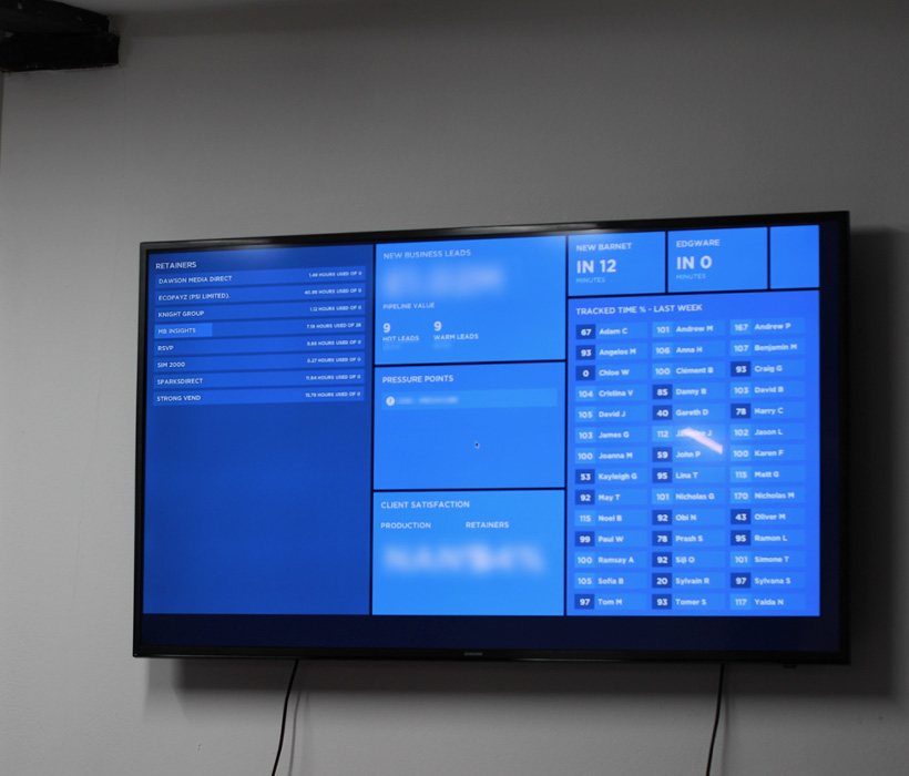
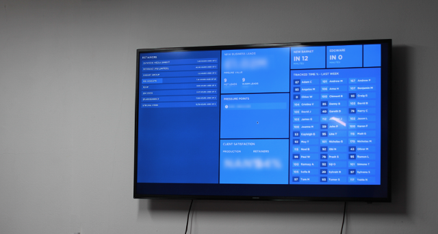
We have a number of TV dashboards in our office. The one above is in the centre of the office and is the default dashboard. This has been designed for all members of staff and no particular department.
Dashboards to the rescue! A well-conceived and well-designed dashboard positioned at the heart of the office can empower communication and decision making in a business. When a dashboard contains effective and relevant data, staff can look at this information and make quick decisions at a glance without assumptions. By seeing trusted numbers in real-time against business goals, people can act without having to confer with a colleague or log into a system. This saves valuable business time. Most importantly, if people can see their sales pipeline or KPIs (where it is and where it needs to be) it can help to motivate the team.
What Types of TV Dashboards Are There?
There are several types of business dashboards an organisation can have. The two key types of dashboards are either on TVs in a fairly public space within an organisation, or behind a login page typically on a user’s desktop. This article is focused on the former - dashboards that are publicly viewable in a ‘common room’ within an organisation. These ‘TV dashboards’ need to have larger fonts, concise information and contrasting colours. It’s also important to mention that an organisation can have different permutations of TV dashboards. For example, the sales team can have a slightly different dashboard to the marketing team, while the HR and leadership teams see a more generic version.
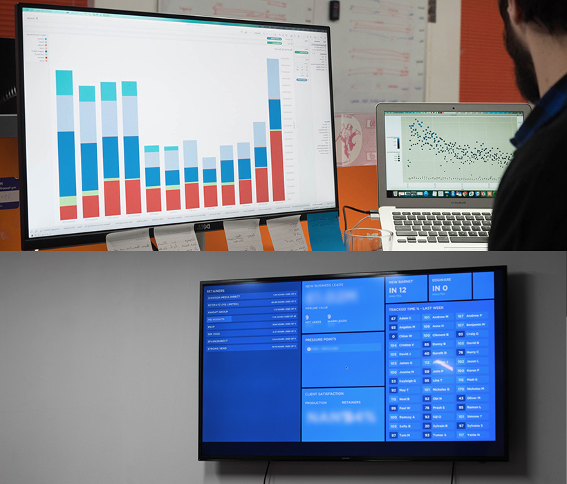
On the image above, you can see a dashboard that is displayed behind a login page at the top, and on the bottom is a TV dashboard displayed in a public place.
USE OF COLOURS ON DASHBOARDS
In 2011, Thomas Sanocki and Noah Sulman conducted an experiment on colour relations. Their experiment concluded that people remember colour patterns better when the colour palette is harmonious, tasteful and well balanced. They discovered that people are able to better remember patterns with 2 colours but struggled with more (e.g. 3-5 colours). We recommend stripping back the use of colours on the dashboards and focusing on 2-3 colours maximum. It’s important to have a strong brand with colours that are “dashboard ready”.
TYPOGRAPHY AND TV DASHBOARDS
Research conducted by Kevin Larson of Microsoft and Rosalind Picard at MIT concluded that fonts can impact a user’s mood. Their experiment presented different sets of fonts into two groups. The group exposed to better sets of typography successfully completed their task with a 4% higher conversion rate. The real insight from this experiment is that the researchers ascertained that better fonts result in better ‘reader moods’. When people look at your dashboard their state of mind will be impacted by font types, sizes and weights!
WHAT BUSINESSES TEND TO SHOW ON DASHBOARDS
At Cyber-Duck we practice what we preach and I would like to share some nuggets of what our own dashboard does. We have effectively been able to combine our business data in terms of our current pipeline and customer satisfaction data, which is just under 90%. The dashboard also displays all of our clients and the time we clocked on their account each month, as well as staff time to see if each staff member is under or over 100%. The results are fantastic and dozens of staff have complimented the clarity in communication around the pipeline and time investment. We’ve even created a number of enterprise dashboards for our clients too!
AGGREGATING DATA FROM DIFFERENT SOURCES INTO DASHBOARDS
You can track anything you’d like in a dashboard, so we also display data showing when the next bus from the office is coming. This helps our staff plan their journey and when to leave more efficiently! Quite often I will see staff glancing at the dashboard around 17:30. None of this would be possible without an application programming interface (APIs). APIs allows a well-conceived custom dashboard to talk to any system that has an API built in – so we’re able to link the bus times to our dashboard.
How Cyber-Duck Approaches Designing of Dashboards
Normally Cyber-Duck approaches dashboard design with a mixture of user-centred design (UCD) and data-driven design (DDD). We want to answer questions like: “why do we need the dashboard?”, “who does this dashboard impact?’, “what data are they interested in?” and “what data is important and why?”. Whilst there are a number of ‘off-the-shelf’ dashboard kits out there, our experience demonstrates creating a bespoke dashboard is better. This is because:
- No dashboard can ‘bring all of your data’ together in a cohesive way.
- Customising dashboard functionality is difficult with the ‘off-the-shelf’ solutions (e.g. applying your unique brand to a third party tool).
- There are issues with putting your data on a third party system in terms of performance and refreshing the data, data security and who sees what.
In short custom or bespoke dashboards are better and give you as a brand much more control. Our business, marketing team and data analyst are Google Analytics Certified Partners (GACP). They’ll guide you through how to generate the best insights for your team through user experience (UX) and data analysis. Cyber-Duck also ensures all dashboard data is secure on your server and/or our one, according to our ISO27001 certification.
Designing a TV Dashboard Step by Step
The UCD and DDD process is key to success. Expert UX Designers spend a few hours figuring out why you need a dashboard and help to create some designs. Our data analyst recommends the best sources for your data and helps to devise the right formulas and analysis techniques. At this point, the backend developer looks at the APIs, CRM and database feasibility to come up with the right web architecture. A front-end developer helps to code the interface and screen. It's also important to mention that the Cyber-Duck help to pick the right TV and hardware for your dashboard too.
Summary
The benefits of dashboards cannot be overestimated. Winston Churchill said that “the difference between mere management and leadership is communication”. By focusing on sharing cohesive information you can move one step closer to effective organisational leadership. Our developers use a clean slate to build a dashboard for each client and typically we can create a dashboard in under 2 weeks of work for your business at a price that suits your organisation. Get in touch if you’re keen to see what data dashboards can do for your business.