
Google has announced the expansion of their mobile-friendly ranking signal’s role in the search algorithm. From the 21st of April, Google will not only label ‘mobile-friendly’ sites, but also use this factor to influence how high pages should rank in search results.
At Cyber-Duck, we’ve begun advising businesses on how to get ready for the game-changing update, which could have a significant impact on their web traffic. It’s definitely time to consider a responsive web design for your main website.
People are increasingly using mobile devices to access relevant, helpful and high quality information while on the go; since mid-2013 traffic from mobile devices in the UK has been on a par with desktop.
Mobile-Friendly Ranking Signal
Google has adapted its search algorithm to this new digital era by increasing the significance of their mobile-friendly ranking. In November, Google began adding a ‘mobile-friendly’ label to websites that provided a great experience on smaller screens, with searches made on mobile and tablet devices. While understated, this had either a positive or negative impact on mobile click-through rates for many websites, depending on if similar sites in the search listings had the label.
From the 21st of April, mobile-friendliness will now be used as a signal to determine whether your website should rank higher in their organic search results. Google have stated that this change will have a “significant impact” on their mobile search results.
The Solution: Responsive Web Design
Responsive web design is the most powerful approach available to designing and building mobile-friendly websites. This is an approach Cyber-Duck have advocated and been implementing since 2011, even before Google recommended taking this approach in 2012. Alternatives to responsive include maintaining a separate mobile or device-specific HTML website. Here are a few compelling reasons why you should implement a responsive web design for your website today:
1. FUTURE-FRIENDLY
New smartphones and tablets with a variety of screen sizes are released onto the market every month. A responsive design ensures your website will display in the best form possible across current devices and future releases. It provides an easy reading experience for any user, by defining ‘breakpoints’ so the website content scales to fit browser windows.
2. MAINTENANCE
Implementing changes to website content will be far easier with a responsive design. Both the desktop and mobile version of your website will be driven by a single code base.
3. USABILITY
A crucial aspect of improving user experience on mobile is incorporating a ‘finger-friendly design’, to optimise for touchscreen interactions. For instance, organise crucial controls (like buttons) towards the base of a screen. This means they will be within comfortable reach of a user, as the standard smartphone grip is with a single hand, using the thumb to tap and navigate around the screen.
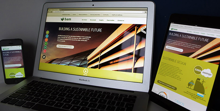
We created a striking, creative website to showcase BAM Construct UK’s sustainability expertise. The vivid design was carefully adapted to display beautifully across devices.
The Future: Performance Evaluation
Google has been experimenting with adding further labels to evaluate the performance of your site. In the future, they could add a red “slow” label in mobile search results, to inform users about slow loading speeds.

A consultant exploring his digital footprint found Google testing a ‘slow’ label in search results on Android.
Google offers PageSpeed Insights to analyse the performance of specific URLs of your website on desktop or mobile, and highlight specific areas of improvement. Now is the right time to consider a revamp, before Google dreams of more ways to highlight website bad practice.
Are You Ready for the Mobile-Friendly Algorithm
Google will increase the power of the mobile-friendly ranking signal from April 21st; unprepared websites could see numbers for their mobile users plummet.
As an agency with dual expertise across user experience (UX) and technical development we are thought leaders when it comes to responsive best practice. With Eurofighter Typhoon, we produced a completely new responsive website with compelling photography and copy in just five weeks. However, a responsive approach doesn’t always mean you need a complete digital revamp; existing designs can be retrofitted, in some cases.
If you’re concerned about your website’s performance on mobile, get in touch with the team of experts at Cyber-Duck today, to discuss the options available to you and the possibility of responsive web design.
