
Matt recently flew to sunny San Diego to speak at the UXPA 2015 conference, organised by the worldwide User Experience Professionals Association. Here are the valuable responsive web design takeaways he offered the audience.
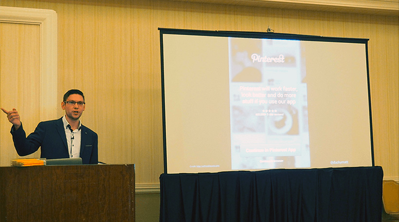
This year’s UXPA conference featured three days of sessions from some of the biggest and brightest minds in the industry. In addition to soaking up the rays and inspiration, Chief Creative Officer Matt Gibson was there to present his latest talk, “Adapting to Responsive Design”.
Responsive design is often framed as an implementation challenge. The technical challenges associated with making our designs fit into a myriad of different form factors. However, in his hour-long session in the Tools & Techniques track, Matt focused on the user experience challenges of responsive design. He looked at how we can make effective, useful and usable designs that go much further than simply applying a few media queries to make everything stretchy.
Matt travelled to San Diego, sharing how we design responsive experiences with a crowd at UXPA.
Matt offered up a host of actionable tips on how to create responsive experiences that are truly exceptional, for all users, on whichever devices they’re using. These ranged from baking performance into the designs we create and devising mobile-first content strategies to implementing more future friendly designs through progressive enhancement.
Check out the slides below and, as always, feel free to get in touch to learn more about how these principles can improve your digital strategy.
