As part of Cyber-Duck’s R&D culture, we constantly evaluate emerging technology trends, to optimise our workflow and be prepared for the future. So, we developed Hoisin.scss, a simple, responsive mini framework, which standardises the work of our front-end team, while giving us full, creative control to tailor work to each project. Here, I will explain the process behind the framework’s creation, and the advantages it brings.
Origins
Way back when I started using CSS Pre-Processors, I knew that the switch from plain CSS would not only give me the advantages of using variables or automating the addition of vendor prefixes; it would become a new way to write re-usable code. Using Sass, I created a grid system and snippets library that I used across many projects, which gave me knowledge and experience about how frameworks work, revealing their huge potential in web design projects.
The rapid growth of the company and the popularity of responsive web design (RWD) meant that the team needed to find a new way to standardise our development process, keeping up with the ‘lean’ approach to project management at Cyber-Duck; we felt that standardisation would allow us to scale the amount of responsive projects and improve maintenance times, without compromising quality.
What We Needed
We all felt that using a framework would be the best solution; we could either build this ourselves, or use a commercial product. Before committing to any of the commercial frameworks currently available, we created a set of further conditions that needed to be met:
- Full control of the code: to be able to optimise and take full advantage of the framework, we had to know exactly what every line of code does, and how and why it worked
- Full creative freedom: the framework should not assume anything about the design, which would allow us to be innovative, and facilitate the development process
- Light and easy to use: it must have a low footprint for the browser (enabling high speeds for the user), and be easy for the team to implement
- Flexible grid system: we wanted to have full control (and flexibility) over how the grid displays to different screen sizes
- No premade set of components: we didn’t need pre-designed buttons, forms or widgets, as we tailor the structure and design of these to each project
What Was Available
At this point, we began to look at the many front-end frameworks which are presented as ‘almighty solutions’ for every design challenge. Twitter Bootstrap and Zurb Foundation were some of the biggest, with a lot of support from the community; other strong alternatives were presented bySkeleton, InuitCSS and YUI.
These options definitely have a lot to offer, and there were many great ideas in each framework which we could learn from; however, as none of them fully met our criteria, they were not what we were looking for. These frameworks are basically UI kits, or a complete set of components, ready for use in projects; this means their structure, shape and details are already fully designed. Our criteria highlights creative freedom as a priority. To be able to exercise this within commercial frameworks, you would have to overwrite the framework itself.
Hoisin.scss
Hoisin.scss started as a set of code snippets we used to copy from project to project, and adapted to fit the differences of each particular case. As we were doing this more and more, we took the most common snippets (the code we changed the least) and compiled a package, which would allow us to use the code easily, only changing a few variables each time.
This spontaneous project evolved quickly because it perfectly fit our requirements. By organising the code better, allowing it to be more flexible, and structuring the files in a way that allow for growth, we ensure that it always works for us. It provides a flexible responsive grid system and simple base to organise CSS styles for everyone who needs it.
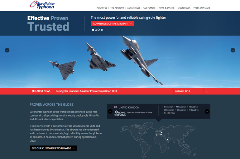
We developed the Eurofighter website in just five weeks; this wouldn’t have been possible without using Hoisin.scss.
The Future
Hoisin.scss is currently available on GitHub for everyone to use, open source and free. We are constantly improving the code, adding more functionality, but keeping its core idea intact. We are also working in a set of rules to add extensibility to the framework, without affecting the core. Please feel free to fork or clone it for your own responsive web projects – we’d love to see what you can do, and get any feedback so we can keep improving and making it better for everyone.