Our side project for the digital community, UX Companion, was one of the first native apps to offer a practical glossary of core user experience (UX) principles. We launched it with over 50 articles, all aiming to demystify the complex jargon of our industry and refresh even the most experienced UX designer’s knowledge of UX terminology.
At the heart of the vibrant user experience (UX) community, there is a confusing, tangled web of terms. A rich, complex language has developed alongside the core design concepts and techniques of UX. As you can already see, this language draws on a lot of acronyms!
After working on various projects, we realised that clients, prospects and even new staff are not entirely fluent in this language. Truthfully, it can be so varied that even other design and development teams do not ‘talk UX’ in quite the same way as us.
We were determined to create a clever tool that could change this. Instead of simply opting to create a traditional website glossary, we realised we could achieve so much more by building UX Companion, a native app. We planned to release the project for iOS initially, and support Android at a later stage.
UX Companion aimed to demystify terminology. Developed as a fun research and development project, it would be launched as a free resource for the digital community.
Preparing for Dev
During the planning stage, we had one central rule that dictated everything we did: the app had to satisfy the full range of end-users. So we firmly committed to a ‘less is more’ philosophy, devising a simple feature list that would achieve this. The team imagined the app mostly as a key tool for designers which could refresh their knowledge. But, we worked hard to also satisfy marketers, interested in the technical processes followed by digital agencies.
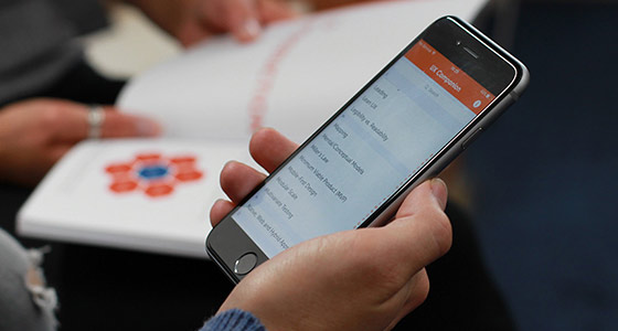
The app was founded upon a pure, alphabetical list of key UX terminology, hand selected from the abundance of material and jargon we came across daily. We began with 50 definitions – which has grown ever since – covering topics from the ‘aesthetic-usability effect’ and ‘80 / 20 rule’, to ‘information architecture’ and ‘the fold’. Each was carefully explained via a brief introduction and practical in-depth description, offering hyperlinks to the best external resources.
We chose a clean, simple dictionary-style design in the end. We used bold colours and elegant typography to inspire confidence in our users while they learned the tricky concepts.

The app launched to great fanfare. It uses a simple alphabetical list to display the content glossary.
Development Begins
We wanted to create the best experience we could, so we implemented both predictive and alphabetical search to increase accessibility and provide navigation options. This seemingly simple interface eliminated the need for scrolling, and made UX Companion far easier to use than online glossaries we came across. Similarly, we enabled use offline to satisfy all kinds of users, whether they’re in meetings, travelling, whatever.
But developing an app to a tight deadline means prioritising what matters most. For us, that meant testing our concept by developing for iOS first and developing for Android at a later stage. A significant portion of our audience would be on Android, so this was a difficult decision to make. Nonetheless, it was vital to the project’s success; it allowed us to quickly release and review feedback for our idea before committing resources to develop it across multiple platforms.
The app was built in XCode using Objective-C: the native language of iOS. We began development just before iOS8 was rolled out for Apple products. We quickly adapted to build within a beta version of Xcode, which could simulate iOS8. This avoided asking users to download a new compatible version so soon after launch.
The Story So Far
Upon initial launch, downloads were steady but slow. However, our awesome marketing strategy helped UX Companion go viral in mid-October 2014. Product Hunt and Usability Geek picked it up as a top resource, which helped us to rack up 7,000 downloads in a single week.
Since then, the feedback has been overwhelmingly positive. UX Companion has received tens of thousands of supportive messages and tweets. By popular demand, we built and launched the Android version in early 2015. In less than a month, it topped over a thousand downloads.

User experience was key to UX Companion's success.
To date, UX Companion has broken the 50,000 downloads mark, with users enjoying its insights across 100 countries. Astounding really, when it was initially pursued as a passion project juggled with the demands of our client work.
Our strategy won the Best Mobile Campaign with the first ever UK Agency Awards. The following year, our continued support won the Best Marketing Campaign with the Wirehive 100 Awards. We were even invited to cover our experiences building and promoting side projects like this, with Smashing Magazine.
We Are Constantly Innovating
Our work on UX Companion is a perfect illustration of the kind of hard work we put into all our side projects. This culminates in our annual hackathon, the Quack Hack. Be sure to check out what we got up to in previous years here and here.
If you think that Cyber-Duck could help you with your digital transformation or R&D project, we’re always happy to help. Feel free to contact us today to see how we could help you.
