Financial Ombudsman Service
UX strategy and website development for the dispute resolution firm
The Financial Ombudsman Service wanted to understand and deliver better experiences for its users. Together, we researched, designed and built a website that could serve the entire British general public. It resulted in an increase in users rating the website ‘easy to use’ and its look and feel, as well as an improvement in conversions.
5%
increase in rating the website as ‘easy to use’
24%
increase in preference for the look and feel
5%
increase in conversions
The Financial Ombudsman Service is the UK’s official body for the fair, impartial resolution of disputes between businesses that provide financial services and their customers. It provides a vital service, dealing with over 300,000 cases a year.
Its website advises how best to manage complaints for end users, as well as businesses. Resource constraints meant the Financial Ombudsman had thousands of outdated content pages, which were hard to digest and navigate.
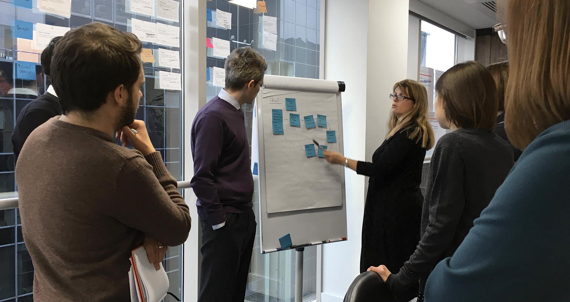
Cyber-Duck has worked as a partner of the Financial Ombudsman to build and implement a user-centred digital strategy. From the outset, we both wanted to understand their users better and build a strategy focused on them – i.e. what is the website’s core purpose, who uses it, and why?
Cyber-Duck and the Financial Ombudsman closely collaborated and co-located to undertake the monumental task of researching, understanding, designing and building for the entire British general public. Together, we placed the needs of consumers, businesses and the Ombudsman’s internal team at the heart of the digital experience.
Our objectives were to improve the:
Our discovery phase begun with hundreds of hours of user interviews with consumers, businesses, and Financial Ombudsman employees. We also conducted in-depth ethnographic research, observing calls to understand users and their thought processes, how the Ombudsman team interacted with them, and the overall journey of a complaint.
This research informed our development of 12 distinct personas, sorted into 3 primary groups: Consumers, Businesses and External. Our persona strategy mapped the complaints journey and key challenges for each group. We identified the awareness of the Financial Ombudsman Service, content required and complaints process for each persona. These were used to draft 552 user stories.
Through workshops with the Financial Ombudsman Service, we audited and mapped the existing content against the new user stories. This identified where we could re-purpose existing content and produce new content to answer user needs. The content audit involved a manual quality review coupled with data analytics.
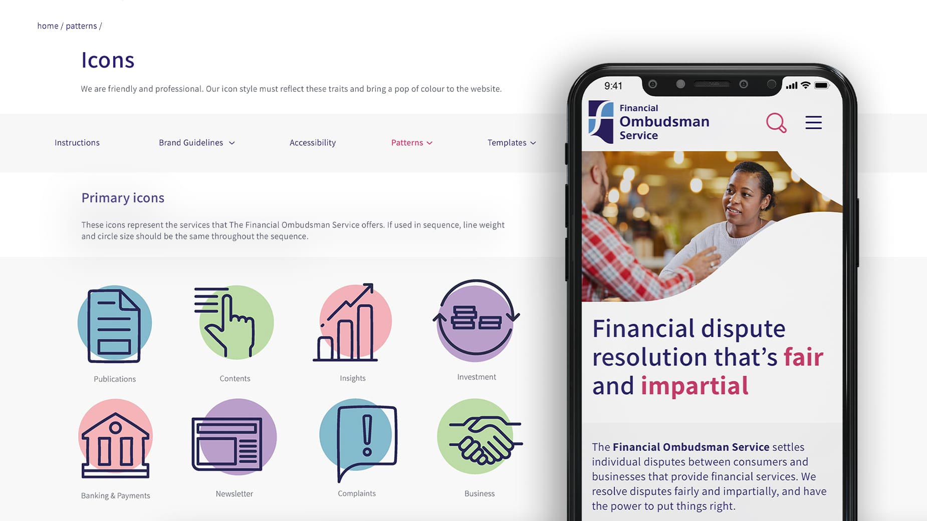
Through really understanding what users wanted from the website the site's information architecture was streamlined significantly, taking it from 1,700 pages to 350.
Next, we tested the new IA via tree testing. Based on user stories, we asked participants to find key content. Our research indicated consumers and businesses had very different needs and expectations.
Through this testing, we validated a key tenet of our new IA. We wanted to separate content into two funnels – ‘consumer’ facing vs. ‘business’ facing content – with clear paths defined for each.
To further articulate the new IA and content strategy recommendations, we conducted creative exploration by prototyping key interactions for the new website based on the user stories; all while considering SEO recommendations from our marketing team.
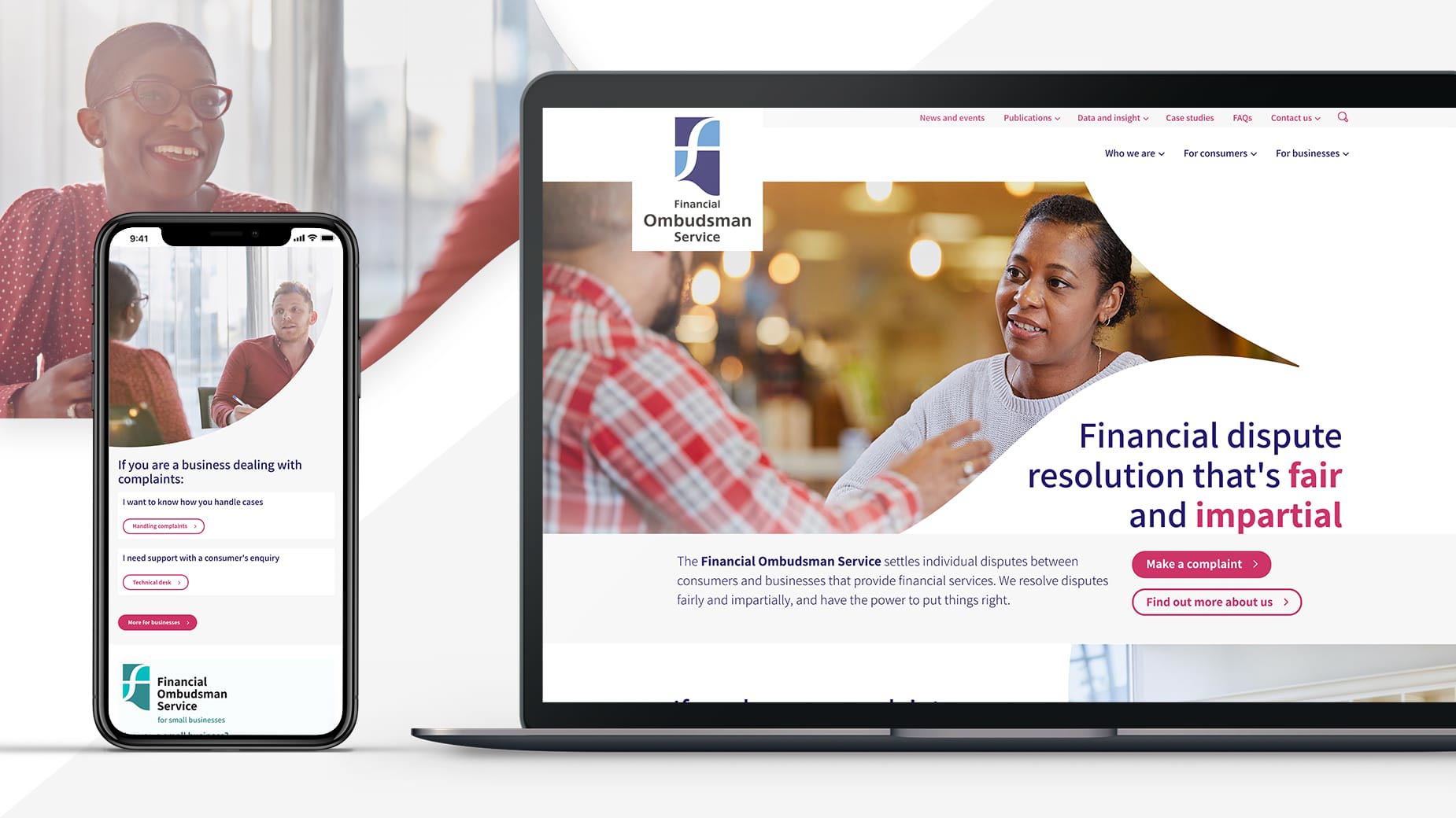
Along with this, we explored fresh visuals and messaging, which more accurately portrayed the friendly and professional personality we’d come to know whilst working with the Financial Ombudsman Service.
A key member of the Ombudsman’s team summarised the result of the Alpha stage by saying:
“This project’s outputs gave us a richer understanding of who uses our website and why. It helps us make reasoned decisions to deliver what users expect from us, in a way which works for them. The new set-up has helped us build a culture of continual development: learning from users through testing, feedback and analytics, to offer the best possible service.”
Following the successful discovery alpha phase in March 2018, we iteratively designed and delivered the new website, collaborating closely with the Financial Ombudsman, including sitting on the Project Advisory Board.
The website had to provide useful, timely content and make it easy for people to find and digest content, and ultimately achieve our collective goals. As a public sector body, the Financial Ombudsman also has a legal obligation to meet accessibility regulations and best practices.
Combined with Cyber-Duck’s passion for accessibility, the website has been developed based on WCAG 2.1 AA standards, including usability testing using assistive technology at the RNIB (Royal National Institute of the Blind).
We configured SilverStripe (an open-source CMS) and managed the content migration and content lifecycle workflows to provide an excellent editorial experience, along with the structures for ongoing governance of content beyond launch.
The new website launched in June 2019. From surveys conducted before and after launch, there has been a 5% increase in people rating the website as easy to use, and a 24% increase in people preferring the look and feel of the website.
This has been emphasised by a 20% reduction in bounce rate; 17% increase in session duration; and a 5% increase in conversions (users starting a complaint).
The Financial Ombudsman Service and our team are delighted that consumers and businesses are measurably finding it easier to manage financial disputes through the new user experience strategy, as validated through user feedback such as:
In November 2019, it has been shortlisted by the UXUK Awards, recognising its results and the solid user centred approach.
5%
increase in rating the website as ‘easy to use’
24%
increase in preference for the look and feel
5%
increase in conversions
Whatever the project or particular challenge you have in mind, we’re here with the right people, process and technology to help deliver the transformation you need.